What Information to Prepare for an Effective Logo
A logo rarely “doesn’t work” because of design. Much more often, it fails because of poor input data.
For a business, a logo is first and foremost a marketing tool and a sign of identification and trust, shaped through design. A logo should be recognizable, distinctive, appropriate for its market, and convenient to use across real-world touchpoints.
For this to happen, designers need more than a nice reference folder. They need a clear set of inputs: meaning, context, constraints, and success criteria.
Based on our team’s experience, far from all clients have a clear vision of their goals and the future of their company (especially when it comes to startups). However, you may be surprised how, during the logo design process, your vision expands and missing informational elements fall into place.
Below is a list of what is worth preparing before the start.

1. The foundation. Describe who you are and what you actually sell
You will need a short, grounded answer without slogans:
- what your product or service does
- what problem it solves
- for whom
- what result the user gets
- what result the business gets
A convenient one-paragraph formula:
We do X for Y to achieve Z. We win through A, B, C.
It is also useful to fix the company’s “why” here, but in a business format:
- why you launched this in the first place
- what you consider fundamental
- what you will never do, even for the sake of growth
Business benefits:
- the logo starts supporting positioning instead of being decorative
- discussions stop revolving around taste and “likes”
- fewer random decisions, fewer revisions
2. Define the logo’s goal right now and the success criteria
You need to honestly describe why this project starts today:
- launch of a new product or direction
- entering a new market
- change of audience
- growth after which the old image became “too small”
- the current mark interferes, is confused with competitors, or is poorly readable
Write down success criteria for the logo as you see them, 3 to 5 points:
- it becomes easier to explain who we are
- the mark is readable at icon size
- visual overlaps with competitors disappear
- the logo looks appropriate in the product and in marketing
Why this matters for the business:
- the designer understands what to optimize for
- the team gains a shared reference point, fewer disputes

3. Define your audience and the decision context
A logo is a signal. Signals are read differently in different environments.
Prepare:
- who the primary buyer or user is
- where they make decisions: in the product, in advertising, at a meeting, in a store, in the App Store
- the audience’s level of expertise
- what acts as a trust marker in your niche
If there are segments, define priorities:
- primary segment
- secondary segment
What the business gains:
- the logo aligns better with market expectations
- lower risk of making something “beautiful” but in the wrong direction
4. Study your competitors and the differentiation zone
Without this, a logo almost always turns out “like everyone else’s.”
You will need:
- a list of direct competitors
- 5 to 10 references from your market — what works well and why
- what must not be repeated: colors, techniques, shapes, typography, mood
It is important to separate “I like it” from “it works.” It is more useful to understand and articulate why, for example:
- “it is easy to read at small sizes”
- “it communicates premium without excessive pomp”
- “it has character and distinction”
Business benefits:
- lower risk of being confused on a shelf, in search results, or in feeds
- a distinctive image forms faster
5. Define the visual direction. Not tastes, but a framework
Choose 2 to 3 words that should be visually readable:
- technological
- reliable
- warm
- bold
- calm
- premium
- democratic
Also add 2–3 words that are explicitly unwanted, for example:
- childish
- overly “corporate”
- aggressive
- cheap
- chaotic
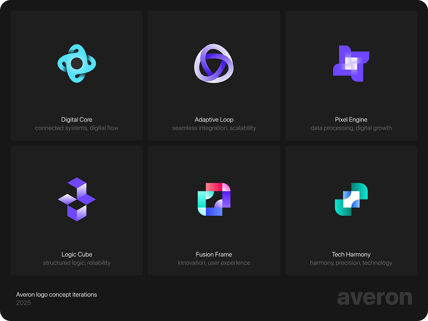
You may add a mini moodboard, but with rules:
- 10 to 20 examples maximum
- annotate what exactly works: color, rhythm, shape, type character, composition
What the business gains:
- the designer doesn’t guess or waste iterations guessing temperament
- decisions become more consistent
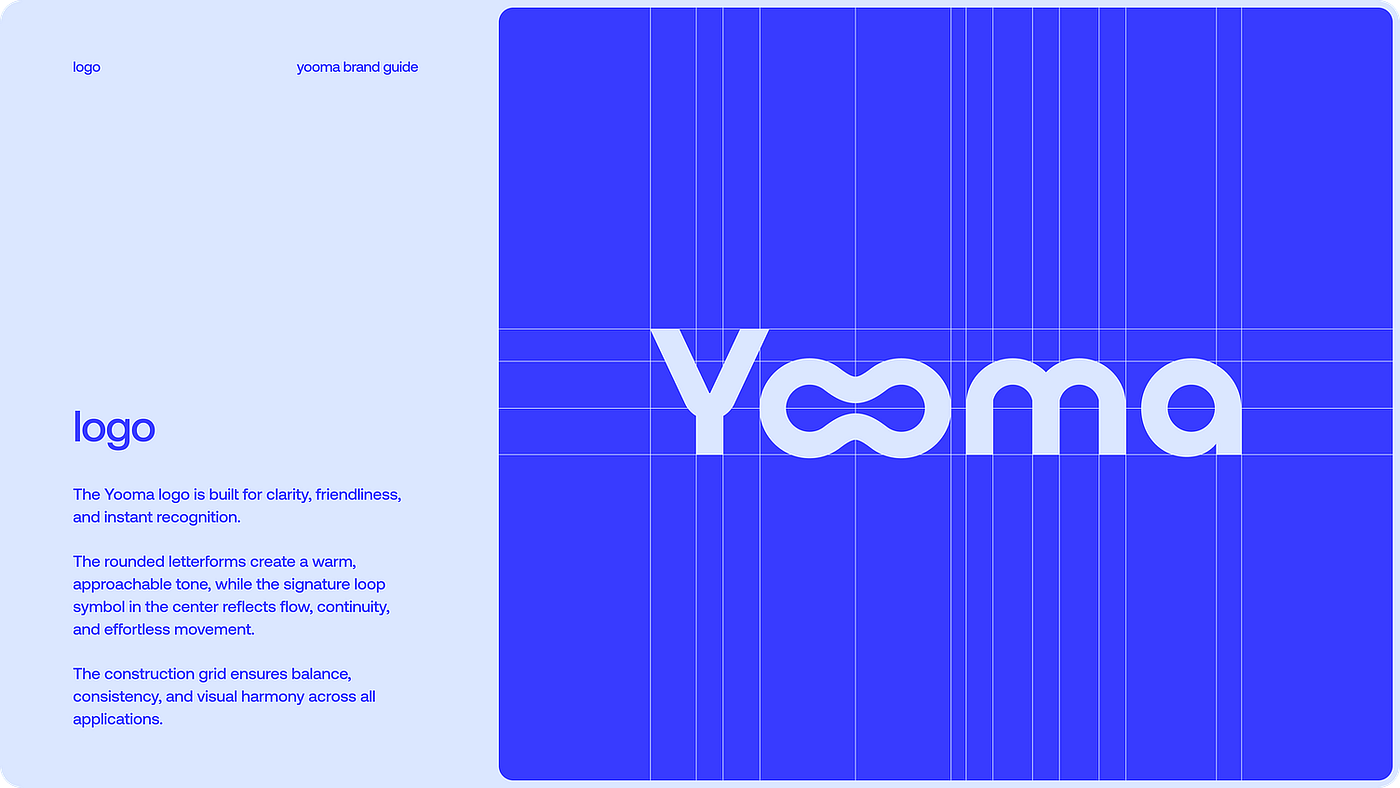
6. Define the logo type. What fits you functionally
Prepare a decision, or at least a preference:
wordmark — the name as the main sign, works well if the name is strong and pronunciation needs reinforcement
- lettermark — initials, suitable for long names
- pictorial mark — a recognizable symbol, useful when the brand aims for broad presence
- abstract mark — an abstract sign, more complex, but can provide uniqueness
- combination mark — symbol plus name, often a good choice for early-stage startups
- mascot — a character, suitable if the business needs an “ambassador” and has resources to support it in communication
What this gives the business:
- lower risk of getting a mark that doesn’t solve recognition tasks
- easier brand scaling and consistency
7. Decide on color and typography. Define constraints
Avoid template thinking like “we need blue because it means trust.” But you do need to understand:
- are there corporate colors already
- are there prohibitions, for example avoiding red or overly acidic colors
- are there requirements for contrast, accessibility, and screen readability
Decide on typography:
- will the logo be text-based
- does it need to be readable at small sizes
- where it will live: product interface, marketing, print
Business benefits:
- fewer revisions due to “suddenly the color doesn’t fit”
- the logo is designed for real conditions from the start
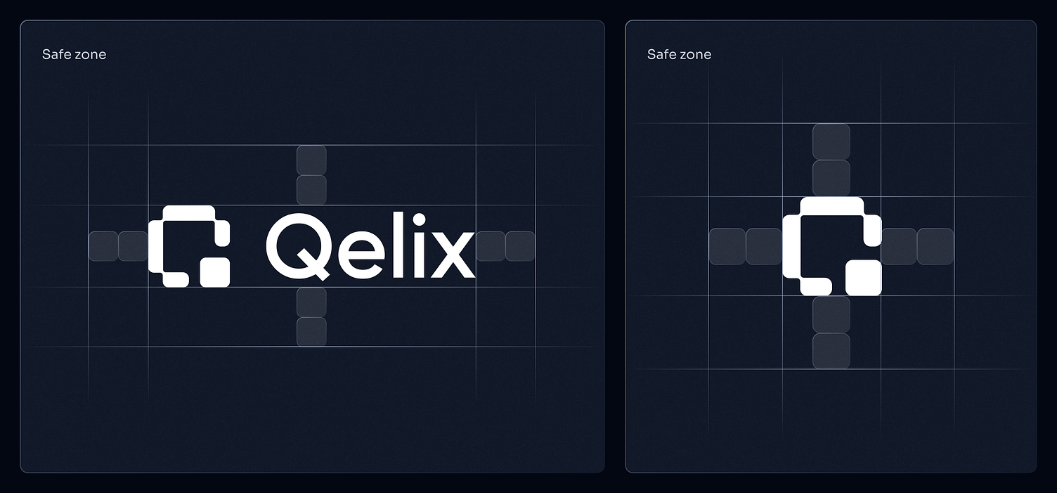
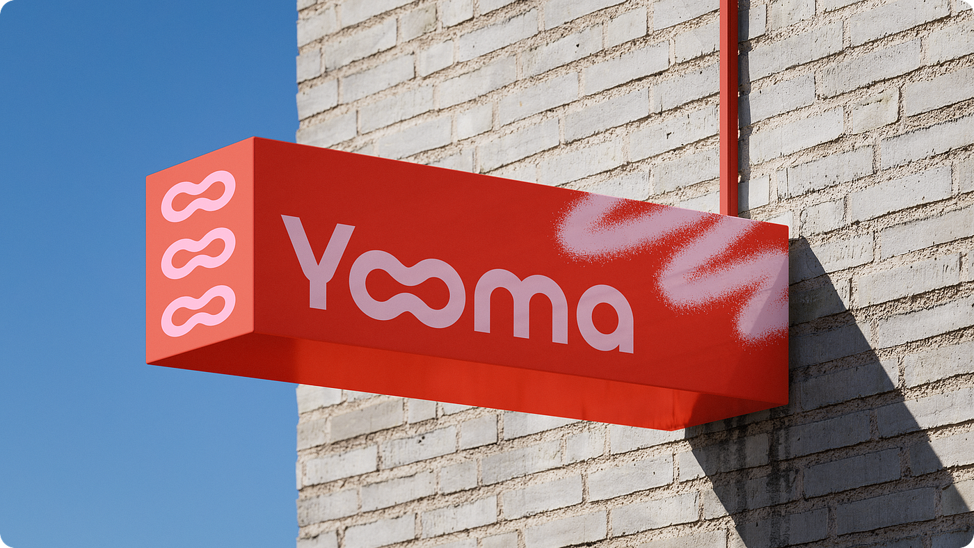
8. Define where your logo will live. Media and technical conditions
Compile a list of 10 key places where the logo will appear in the first 6 months:
- website
- product, web and mobile
- app icon
- social media
- investor and sales presentations
- advertising banners
- email signature
- favicon
- packaging, if applicable
- merchandise, if applicable
If there are extreme scenarios, note them as well:
- very small size
- monochrome
- dark background
- animation
What the business gains:
- fewer surprises at launch
- the logo doesn’t “break” in real formats
9. Define how decisions are made and how feedback is given
You are undoubtedly interested in fast, coordinated work and mutual understanding among everyone involved.
Define in advance:
- who makes the final decision
- how many stakeholders review
- how feedback is collected: one document, one responsible person
- deadlines for feedback rounds
Business benefits:
- the project doesn’t stall
- the designer receives clear inputs instead of contradictory comments

10. Test by criteria, not personal taste
Instead of subjective “like / dislike,” use validation:
- recognizability at small sizes
- distinction from competitors
- name readability
- appropriateness for your category
- ability to last several years without looking outdated
- performance in black and white
For a quick test, you can show 2 to 3 options to people from your target audience and ask:
- what kind of company this seems to be
- what impression it leaves
- what is remembered after 10 seconds
Business benefits:
- lower risk of launching a logo that is “beautiful” but ineffective

11. Implementation. A logo brings value when it is used correctly
A logo alone does not create recognition. Recognition is created through repetition at the right touchpoints.
Prepare a mini rollout plan in advance:
- update the website and product
- update social media and avatars
- update presentations and templates
- update signatures, documents, emails
- if there is packaging, plan a transition period
Business benefits:
- the logo starts working immediately after release, not six months later through random usage
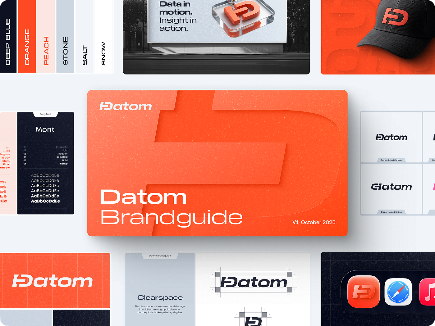
12. What you should receive as a result
To avoid the feeling of “I don’t understand what I’ll get in the end,” fix expectations around deliverables:
- primary logo versions: horizontal and vertical
- the symbol, if included, separate from the wordmark
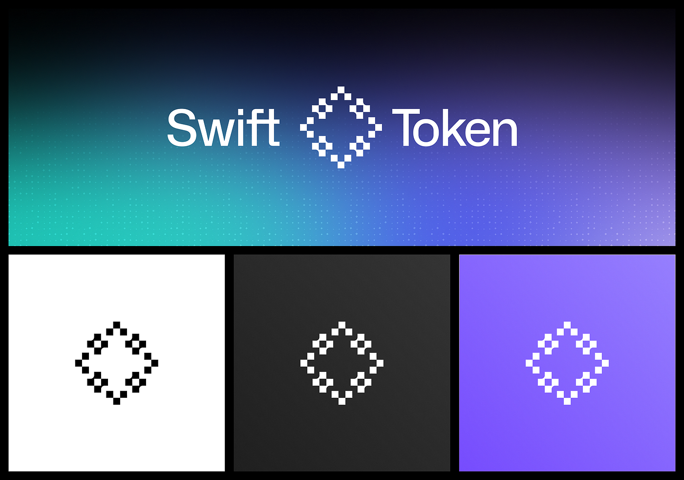
- versions for dark and light backgrounds
- monochrome versions
- minimum size and spacing rules
- file sets for digital and print
Formats:
- vector formats: SVG, PDF, or EPS for scaling
- PNG with transparency for web and presentations
- if necessary, favicon and app icon variants
Why this matters for the business:
- the team doesn’t “extract the logo from the website via screenshot”
- fewer usage errors, higher consistency, higher trust
Practical checklist before starting
To move fast, collect everything into a single document and attach materials.
Business description
- what you do, for whom, what problem you solve
- 2 to 3 key differentiators
Logo goal
- why now
- success criteria, 3 to 5 points
Audience
- primary segment
- where decisions are made
- trust markers
Competitors
- list of competitors
- what must not be repeated
Visual framework
- 2 to 3 character-defining words
- 2 to 3 prohibitions
- mini moodboard with comments explaining why
Touchpoints
- where the logo will be used most often
- extreme scenarios: small size, monochrome, dark background
Process
- who approves
- how feedback is collected
- feedback round timelines
Result
- which versions and formats are required
AI tools for preparing logo requirements
At the preparation stage, AI tools can help structure your thinking about a logo before any design work begins. They are useful for clarifying direction, constraints, and expectations.
- Logo Diffusion
(Helps explore the level of abstraction, logo type, and visual complexity to understand whether a symbol is needed and what role it should play functionally.) - Looka
(Useful for identifying an overall visual direction and ruling out styles that clearly do not fit, before engaging a design team.) - Brandmark
(Helps evaluate readability, scalability, and how different logo structures behave across sizes and contexts, without committing to a final result.) - Trademarkia
(Used to analyze visual overcrowding within a category and identify overused or clichéd symbols at an early stage.) - Fontjoy
(Helps understand which typographic character aligns better with the brand and whether a text-based logo can work without a symbol.)
Used this way, these tools replace guesswork with clearer inputs and make collaboration with designers more focused and efficient.

Conclusion
An effective logo starts with clarity: goals, audience, differentiation, and usage context. The more precisely the input data is prepared, the faster the project moves and the higher the return for the business.
Your logo is the banner you carry into the market battle. And this is not pathos, it is reality.