Pitch Deck Design in 2026: How to Make Investors Understand Your Business Faster
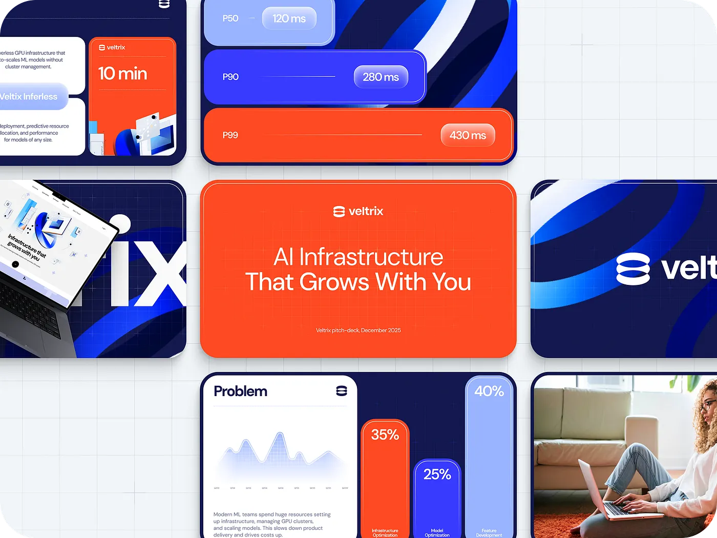
Investors don’t read pitch decks the way founders build them.
Founders usually move slide by slide: problem, solution, market, product, traction, team.
Investors move by doubt. They scan for the business model, jump to traction, check the product, team, and ask. If the logic doesn’t become clear fast enough, the deck quietly loses them.
In 2026, a strong pitch deck has one job: help an investor understand the business before they lose interest.
That means less decoration, fewer generic claims, and more structure. The best decks make the product, numbers, risks, and next step easy to evaluate.
Here’s what investors actually notice, and how to design for it.
1. Design the deck for scanning
Founders usually build pitch decks as a story: problem, solution, market, product, traction, team.
Investors rarely read them that way.
They jump. They scan. They look for the parts that reduce doubt fastest: traction, product, business model, team, and ask. That means each slide has to work on its own, because it may be the first slide an investor really pays attention to.
A strong deck behaves less like a linear story and more like a clear interface. Each slide answers one question. The headline gives the conclusion. The visual supports it. The layout helps the investor understand what matters first.
A weak slide explains. A strong slide makes the point obvious.

Design move
- Write headlines as conclusions, not labels.
- Keep one idea per slide.
- Structure content like product screens, not posters.
- Remove anything that doesn’t help the investor understand the business faster.
Tools that help
Gamma and Tome can help sketch the first structure quickly.
Figma gives better control over layout, hierarchy, and final visual polish.
Business impact
A deck designed for scanning is easier to understand and has a better chance of becoming a real conversation.

2. Bring the numbers forward
A strong idea still matters. But investors usually look for proof earlier than founders expect.
They want to see how the business works in numbers: how customers come in, what acquisition costs, how fast revenue can grow, and whether the market opportunity is realistic enough to act on.
The right metrics give investors a faster way to judge whether the business holds together.
Strong numbers give investors something solid to judge.
If you already have signals, bring them forward:
- LTV:CAC: how much a customer brings in compared to what it costs to acquire them
- CAC payback: how fast you recover acquisition costs
- early revenue or usage patterns
- retention cohorts
- realistic SOM instead of a huge abstract TAM
Don’t bury this information near the end. These are often the slides investors scan when deciding whether the business deserves a deeper look.
A massive market number can look good on a slide, but without a clear path to reach it, it feels vague. A smaller, more realistic market segment often feels stronger because it shows where the company can actually win first.
Retention is especially useful. It shows product reality fast. If users come back, stay active, or expand their usage over time, the deck starts to feel less like a promise and more like evidence.
Design move
- Replace long explanations with clean charts.
- Put the main takeaway directly on the visual.
- Show SOM instead of relying only on abstract market size.
- Highlight the metric that matters most for this stage.
- Remove secondary numbers that create noise.
Tools that help
Tableau and Power BI can help organize and visualize more complex data.
For early-stage decks, Figma is often enough if the goal is to turn raw numbers into clear investor-facing slides.
Business impact
Clear numbers help investors understand the business faster. And the faster they understand the logic, the less room there is for doubt.

3. Keep the design calm
Some pitch decks try too hard to impress.
You open them and everything competes for attention at once: bold colors, complex layouts, oversized visuals, dramatic gradients, animated mockups. It may look expensive, but it doesn’t always make the business easier to understand.
For investors, that becomes friction.
They go through too many decks to decode visual noise. The decks that stand out are usually calm, structured, and easy to move through. The business gets the attention, not the decoration.
Good design doesn’t need to announce itself. It helps the investor see what matters first.
Confidence in a pitch deck often feels quiet. The hierarchy is clear. The slides breathe. The numbers are easy to read. The product is visible. Nothing feels like it was added just to make the deck look more “designed.”
Design move
- Limit the deck to one or two typefaces.
- Use a restrained color system.
- Let whitespace create hierarchy.
- Keep layouts consistent from slide to slide.
- Remove decorative visuals that don’t explain the product, market, traction, or business model.
- Make key numbers and conclusions easy to find in one glance.
Tools that help
Beautiful.ai can help with quick, clean slide structure.
Figma gives more control when the deck needs stronger art direction, custom layouts, and investor-facing polish.
Business impact
Calm design lowers friction. The deck feels easier to read, easier to trust, and easier to discuss.
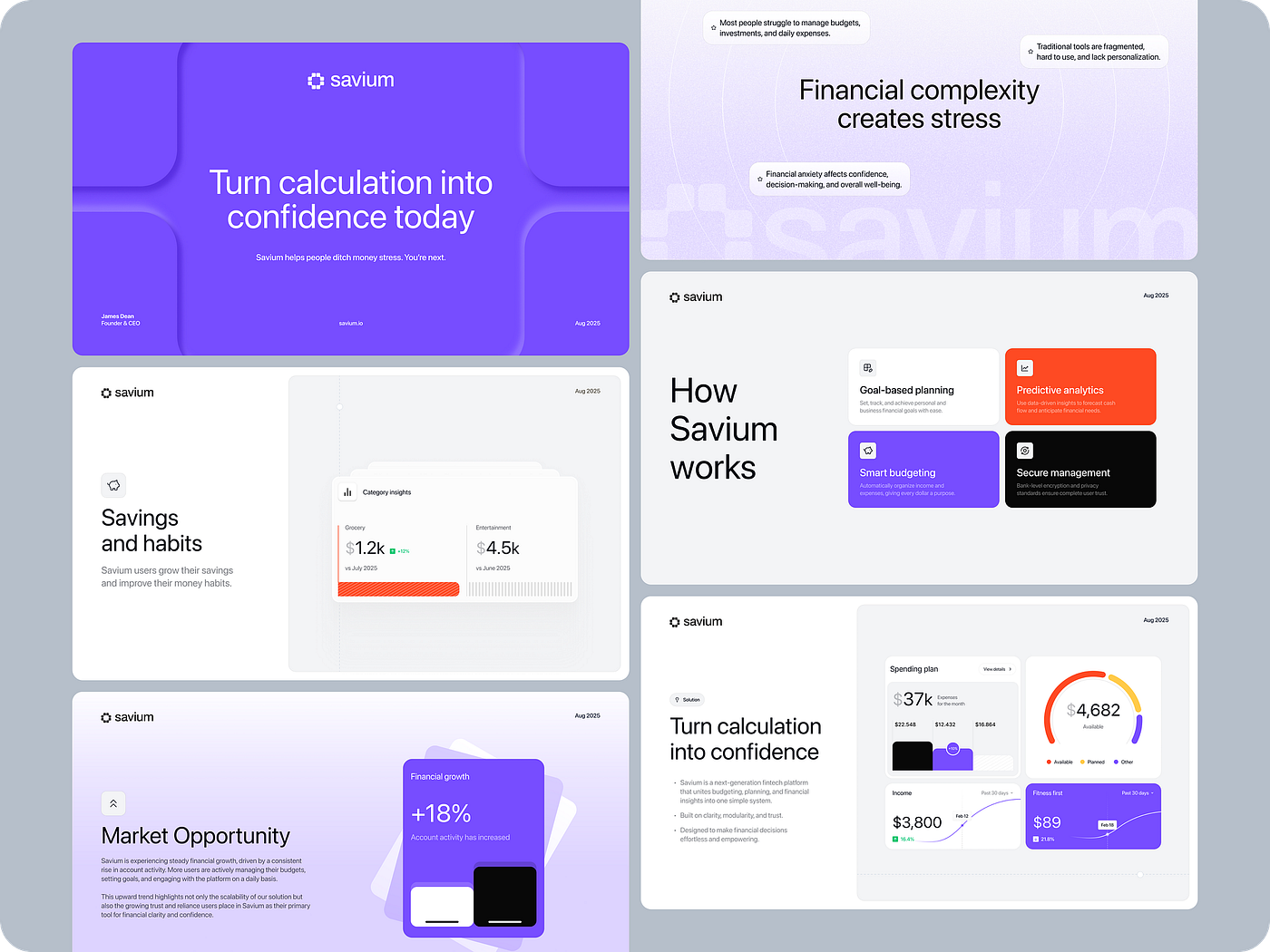
4. Use AI for structure, not for thinking
AI made it easy to generate a pitch deck in minutes. It also made average decks easier to produce at scale.
At first, many AI-generated decks look fine. The structure is clean. The wording is smooth. The flow feels familiar. But after a few slides, something starts to disappear: specificity.
The deck sounds correct, but interchangeable. You could swap the company name, and not much would change.
That’s where the problem starts.
Investors don’t respond to polished generic logic. They respond to signs that the team understands its own business sharply: the real problem, the timing, the market pressure, the product advantage, and the reason this company has a chance to win.
AI can help sketch the structure, simplify messy language, and test a few directions quickly. But the core slides still need human judgment. The problem slide, differentiation, “why now,” product logic, and go-to-market story should feel tied to this business specifically.
That’s where the texture of thinking shows up.
AI can speed up the draft, but the deck still needs a point of view.
Design move
- Use AI to create the first structure, not the final deck.
- Rewrite the key slides manually.
- Check every important claim for specificity.
- Remove phrases that could belong to any startup.
- Keep the problem, product, and differentiation tied to real business context.
- Use AI to simplify language, but keep the judgment human.
Tools that help
ChatGPT and Claude can help with structure, language cleanup, and quick variations.
Figma is better for turning the final logic into a controlled visual system.
Business impact
AI can speed up the deck process. But the thinking still has to feel specific, or the deck becomes forgettable.
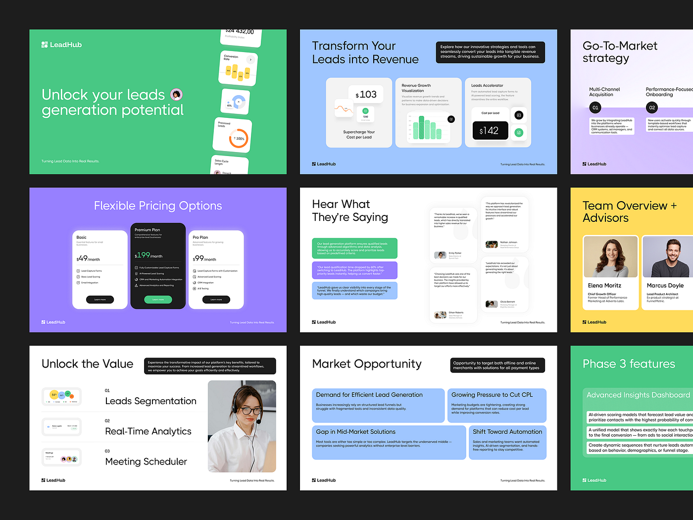
5. Compress every slide to one clear point
A strong slide doesn’t ask the investor to slow down and figure it out. The point should land almost immediately.
The headline gives the conclusion. The visual proves it. Everything else either supports that point or gets removed.
That’s what compression means in a pitch deck. Not making the slide empty. Not cutting useful context. Making the signal easier to see.
Instead of explaining the same idea twice, let each element do its job. The headline should say what changed, what matters, or what the investor should notice. The chart, screenshot, or metric should make that statement credible.
For example:
Customer acquisition cost dropped 32% after the product change.
One chart. One annotation. One clear takeaway.
If a slide takes too much decoding, it starts working against the deck.
Investors usually won’t stop to untangle the logic. They’ll move on, or they’ll carry the doubt into the next slide.
Design move
- Make the headline the takeaway, not a category label.
- Use the visual as proof, not decoration.
- Remove repeated explanations.
- Cut secondary metrics unless they change the conclusion.
- Keep annotations short and specific.
- Test each slide: can the main point be understood in 3–5 seconds?
Tools that help
Figma helps control hierarchy, spacing, and slide structure when every element has to earn its place.
Gamma can be useful for quickly testing different ways to organize the same idea before refining the final version.
Business impact
Compression lowers cognitive load. When each slide has one clear job, more of the business logic actually lands.
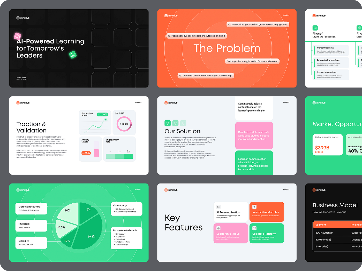
6. Show the risks before investors have to guess
Every business has risk. Investors know that before they open the deck.
The question is whether the team sees those risks clearly.
When a deck avoids risk completely, it creates a quiet gap. The investor starts filling that gap on their own: market risk, acquisition risk, technical risk, regulatory risk, team risk, pricing risk. And those guesses usually don’t help the company.
It shows that the team understands where the business can break, what the impact might be, and how they plan to reduce that risk over time. The goal is not to make the company look safe. The goal is to make the thinking look honest and controlled.
A calm, factual risk slide can build more trust than another confident claim.
The best version is simple: name the risk, explain why it matters, and show how the team is already thinking about it.
Design move
- Dedicate one slide to the main risks.
- Structure it simply: risk, impact, mitigation.
- Keep the tone factual, not defensive.
- Focus on the risks investors are likely to ask about anyway.
- Avoid vague reassurance.
- Don’t overload the slide with every possible scenario.
Tools that help
Figma works well for a clean risk matrix or a simple risk, impact, mitigation layout.
Notion can help organize internal risk thinking before turning it into a slide.
Business impact
Clear risk framing reduces hidden doubt. It helps investors see that the team understands both the upside and the pressure points.
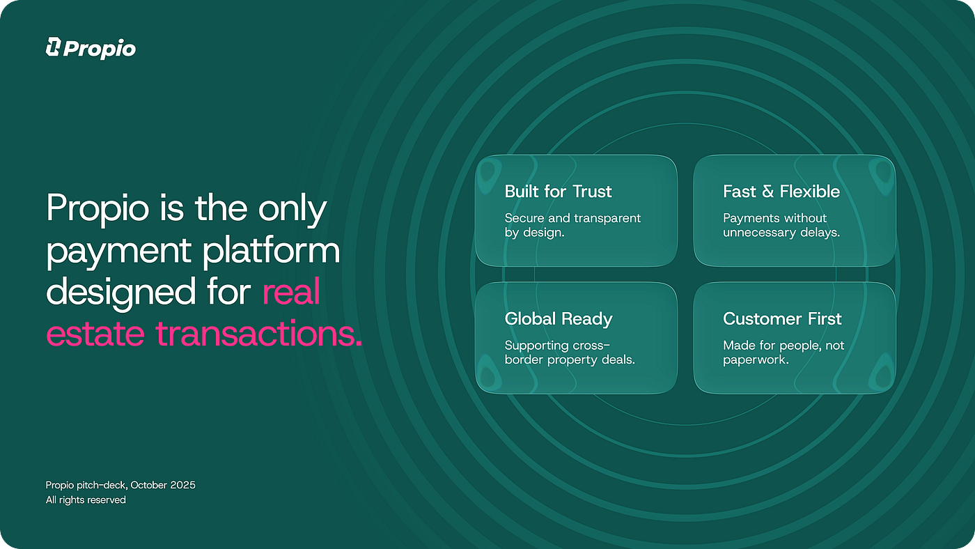
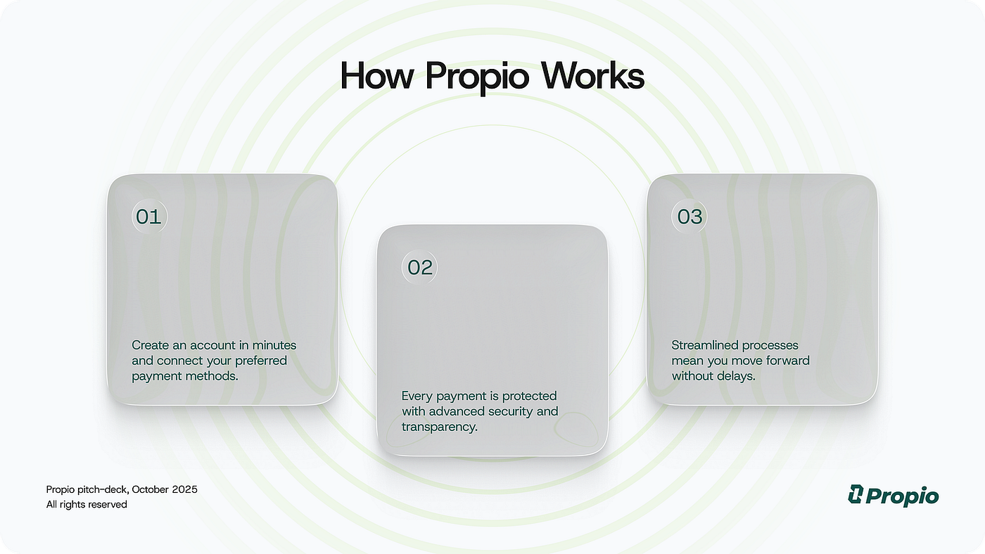
7. Show the product as a real experience
Abstract vision is easy to write and hard to evaluate.
Phrases like “transforming the future of…” may sound ambitious, but they don’t give investors anything concrete to hold on to. At some point, they need to see what the product actually does.
- Who is it for?
- What problem does it solve?
- What becomes easier, faster, cheaper, or more controlled after someone starts using it?
The faster the deck answers these questions, the easier the business becomes to understand.
This is where many pitch decks lose clarity. They describe the idea, the category, or the market shift, but never quite show the product itself. The investor has to imagine how it works. That creates distance.
A real screen, workflow, or product flow removes that gap.
It doesn’t have to show the whole product. In most cases, it shouldn’t. One clear core flow often says more than five abstract slides. It helps the investor understand the product logic, the user value, and the business model at the same time.
Once the product becomes visible, the rest of the deck starts to feel more grounded. The metrics have context. The market feels less abstract. The risks become easier to evaluate.
A concrete product moment helps investors understand what the business is built around.

Design move
- Show real UI, product flows, or key screens instead of abstract concept visuals.
- Focus on one core flow, not the whole product.
- Add short annotations to explain what matters.
- Show the user action, the product response, and the outcome.
- Remove screenshots that look nice but don’t explain the product logic.
- Make sure the product slide answers: what does this actually do?
Tools that help
Figma is the strongest option for turning product screens and flows into clear investor-facing slides.
Notion can help organize product logic, user flows, and feature priorities before they become visuals.
Business impact
Visible product logic reduces uncertainty. When investors can see how the product works, the business becomes easier to evaluate.

8. Adjust the deck to the conversation
The same deck can land differently depending on who reads it.
One investor may care most about growth. Another may focus on the product. Someone else may look closely at go-to-market, margins, regulation, or the team.
They are all reading the same business, but they are not looking for the same proof.
That’s where a single “universal” deck can start to feel weak. It tries to cover everything evenly, and the sharpest parts get diluted.
Strong teams don’t rebuild the deck from scratch every time. They adjust the emphasis.
The core story stays the same. The business doesn’t change. But the order, depth, and focus can shift depending on the conversation.
For one investor, the traction slide may need to come earlier. For another, the product flow may need more space. For a third, the go-to-market logic may need a cleaner explanation.
This kind of adjustment doesn’t make the deck less consistent. It makes it more relevant.
The goal is to meet the investor where their attention already is, instead of forcing every reader through the same path.
A flexible deck lets you lead with the proof each investor needs most.
Design move
- Build modular slides that can be reused and rearranged.
- Keep the visual system consistent across versions.
- Create stronger versions of key slides: traction, product, go-to-market, market, and ask.
- Adjust emphasis without changing the core business story.
- Avoid overloading one deck with every possible angle.
- Keep a clean master version so the deck doesn’t fragment over time.
Tools that help
Figma is useful for keeping several deck versions consistent while adjusting structure and emphasis.
Notion can help organize investor notes, objections, and version logic before updating the deck.
Business impact
A more relevant deck leads to a better conversation. When the emphasis matches the investor’s attention, the business is easier to evaluate.

9. Make the ask specific
The final slide should make one thing clear: what you are raising, why you need it, and what changes after the money comes in.
This is where many pitch decks become vague.
“We’re raising $3M to grow the team and expand marketing.”
It sounds reasonable, but it doesn’t explain enough. Grow the team for what? Expand marketing through which channels? What milestone should this money help the company reach?
The amount itself is only part of the ask. Investors need to see the logic behind it.
A stronger ask connects three things:
- the amount you are raising
- the milestones you plan to reach
- the timeline for getting there
For example:
We’re raising $2.5M to reach $1.2M ARR within 18 months and prepare for Series A.
Now the ask feels like a plan.
Investors want to see where the money will go, what progress it should create, and where the company is heading next.
The more concrete the ask is, the easier it becomes to evaluate. A vague ask creates extra questions at the exact moment when the deck should be moving the conversation forward.
Design move
- Show the raise amount clearly.
- Connect the amount to milestones and timeline.
- Explain how the money will be used without turning the slide into a budget table.
- Make the next funding or business milestone visible.
- Keep the ask on one focused slide.
- Avoid generic phrases like “grow the team” or “expand marketing” without specifics.
Tools that help
Figma works well for turning the ask into a clean milestone slide.
Notion can help organize the use of funds, hiring plan, and milestone logic before it becomes a final slide.
Business impact
A specific ask makes the fundraising plan easier to judge. It helps investors understand what their capital is expected to unlock.
10. Improve the deck after every conversation
A strong pitch deck rarely appears fully finished from the first version.
The first draft may feel clear to the team because the team already knows the business. But once real conversations start, weak spots become visible.
A slide needs extra explanation. A metric raises the wrong question. A product point feels obvious internally, but doesn’t land for investors. The ask makes sense to the founder, but not to the person evaluating the next round.
That feedback matters.
The best teams treat the deck as something they keep sharpening. Every investor conversation gives useful signals: where people hesitate, where they jump ahead, where they lose the thread, and where they ask the same question again.
The deck doesn’t need a full rebuild after every call. It needs sharper answers in the places where investors slow down.
That might mean bringing traction closer to the front, turning a vague product slide into a clear flow, tightening the ask, or rewriting a headline so it gives the point instead of naming the topic.
Over time, the deck becomes clearer as the team learns how the business is actually being read from the outside.
Design move

Design move
- Track repeated investor questions and turn them into clearer slides.
- Version key slides instead of endlessly polishing one version.
- Test different ways of explaining the same idea.
- Refine hierarchy when a slide needs too much verbal support.
- Keep the deck easy to edit, not just visually polished.
Tools that help
Figma helps keep the deck flexible while preserving visual consistency across versions.
Notion can help collect investor feedback, objections, and recurring questions after calls.
AI tools such as ChatGPT or Claude can help test alternative headlines or simplify explanations, but the final judgment should stay with the team.
Business impact
A deck that improves after every conversation becomes easier to understand and easier to trust. That clarity compounds over time, while most decks stay stuck in their first polished version.
Final thought
A pitch deck doesn’t need to explain the whole company at once. It needs to help investors see the business clearly enough to decide whether the next conversation is worth having.
That decision often happens faster than founders expect.
If the product is visible, the numbers are easy to read, the risks are named, and the ask is specific, the deck starts doing its real job. It turns a complex business into something investors can understand, question, and evaluate.
That is where design matters most: as structure, hierarchy, and focus.
A good deck makes the business easier to read. A stronger one makes the next step easier to take.