Improving Mobile App UX/UI
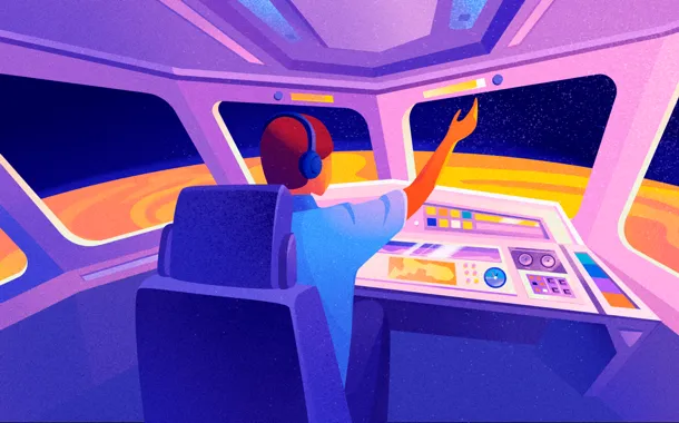
We designers often liken a project launch to that of a rocket or an airplane. Going along with this metaphor, the website is the demonstration of the rocket, whereas the app is the launch control panel. Which is where the principal difference lies.
Imagine someone who knows nothing about piloting being put in charge of a cockpit. Will they be able to tell at a glance how to take off and fly? If you give them a simple and comprehensive set of instructions, if the control panel is intuitive, they will. This is exactly what the purpose of UX/UI is: to help the user quickly find their way and accomplish their goal.
The most popular things are the ones that make life easier. So today’s motto of the designer and developer is “Let’s make it simpler and easier!”
(Aircraft control panels still look so complicated because web designers haven’t gotten their hands on them.)
Let’s see how we can simplify and improve things so that users can just “get in, push a button, and take off.”
1. Functional minimalism
Apps normally serve to achieve simple tasks. They shouldn’t exhaust users with multiple actions and distract them from their goal.
Functional minimalism is a “no-frills” principle. This applies to everything: contents, number of actions, design elements. Whereas a website can afford to have lots of contents and attention-grabbing design features, for an app it is a kiss of death. There’s too little visual space, so it must be strictly business. But “no frills” doesn’t mean it should be boring, simplistic, or monotonous.
Here’s what it means:
- minimum cognitive load;
- minimum actions;
- logical actions and transitions;
- simple actions;
- simple design.
Mobile app design is based on these very principles of functional minimalism. Laconic graphics, the presence of negative space between elements, a simple and minimal color palette. Any design element must be functionally justified.
2. Order, consistency, predictability
Order is the organized presenting of all the necessary things on the screen. It’s a structured hierarchy of contents, a logical sequence of transitioning from the entry point to the app’s main goal.
The less the user has to think about what they need to do, the better. Let the interface guide them. This implies a simple and easy way with no distractions. Not everyone is as attentive as designers, so don’t make them search for the things they need or try to figure out where everything is.
Navigation should be consistent and understandable. Making the user lose their way between screens is absolutely inexcusable. So don’t hide navigation elements or move them during transitions. If you need to, you can use visual hints.
3. Interaction
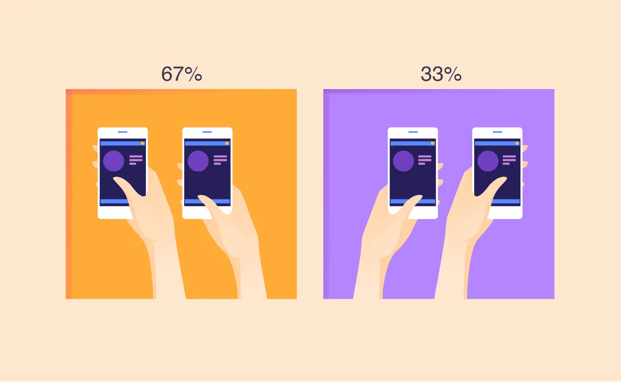
Ways of holding the phone
To program navigation, you must understand how users interact with their mobile devices. Different app tasks require different ways of interacting. It’s important to determine which ways will be used for your specific task and remember that people hold their phones differently depending on the situation. There are three main ways: one-handed, using one thumb; two-handed, using one thumb; and two-handed, using two thumbs.
Here’s a helpful diagram by Steven Hoober:
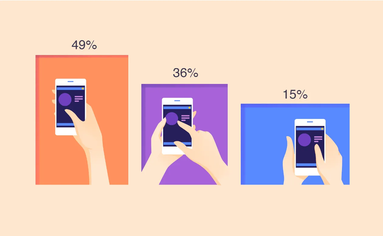
An app should be easy to use with one hand and on a big screen. Here are interactions with one hand:
Gestures
Navigating an app through gestures has many advantages both for the user and the developer. The gestures must be natural, logical, and relevant to the task at hand.
The most popular finger gestures include:
- touching
- pressing
- holding
- double click
- dragging
- tapping
- swiping
- scrolling
- two-finger scrolling
- pinching and spreading
Users are used to certain models of interaction, so it’s best to utilize familiar patterns. There should be no surprises here.
Animation
Animation livens up the interface and helps interaction like nothing else. It must be strictly functional and never too long or intrusive.
Gamification
The best way of motivating the user to use your app is adding game mechanics, as long as it is appropriate and relevant to the objectives of both the app and the audience.
4. Everything must be close at hand!
Or rather, at the fingertips. The main actions should draw the users’ attention through prominent positioning of an icon or button. Menu options should be large enough to be easily selectable. Elements can’t be too small or cluttered too close together. Not all people have slim fingers and perfect motor skills, so keep that in mind.
Fields for entering data, form to be filled out, and selections to be made should all be positioned in the lower part of the screen. The information needed to move forward must be located within the thumb zone.
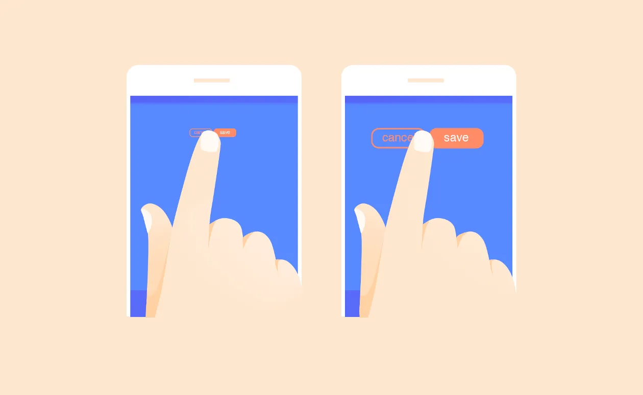
5. Blur method
This method enables you to see what the user will see at first glance and check whether the accents have been placed properly. You can use the blur effect or just put on wrong prescription glasses — whatever lets you see the elements fuzzily.
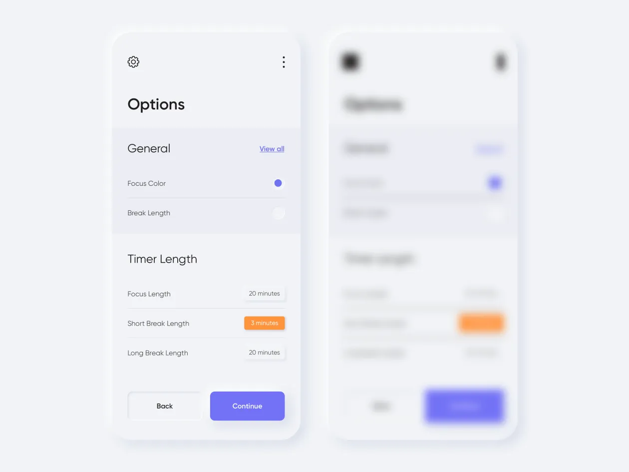
Let’s look at an example of a blurred fill-out form:
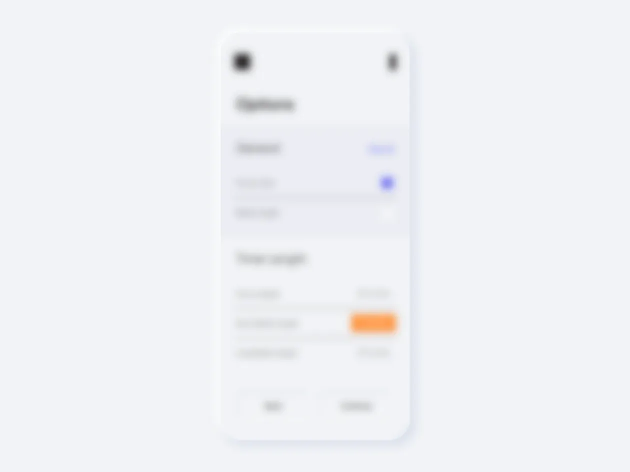
It looks like you need to select an option and then press the yellow button. The original, however, looks like this:
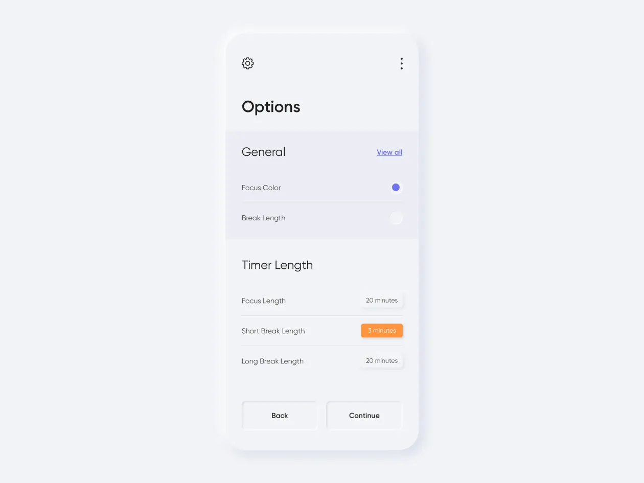
This means the accents are all wrong. The important buttons are obscured, and the accent is on the wrong button. The user is disoriented. They automatically press the blue button and go to a wrong destination.
The blur method is useful for checking whether the interface guides the user to the right place. It’s an easy way to separate the main features from the secondary ones, identify the missing accents and monotony. By identifying a mistake, we can emphasize the most important features and visually tone down the secondary ones.
To make sure important interface elements are legible and visible even in low light, we must utilize the principles of contrast.
Top Secrets of Contrast in Design
6. Locality
The locality principle is similar to the general principle of interaction, i.e. the accessibility of elements, except it has more to do with visual and psychological perception.
Any result-oriented action must take place close to the suggestion to take that action.
Designers are often tempted to place an element wherever they can find the space for it. But if we’re talking about any action, then the element that helps perform that action must logically be close, and the closer the better!
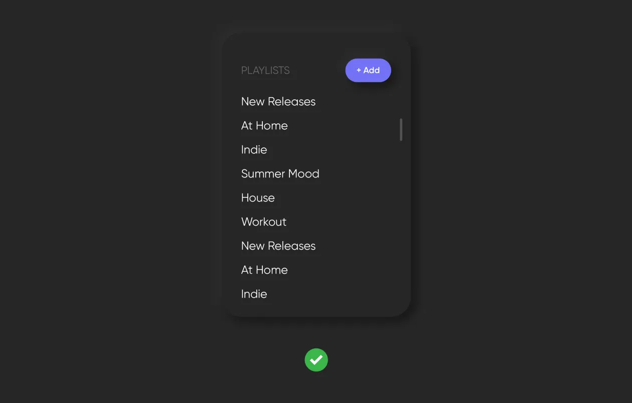
And let’s not forget about the progress of events. Say you need to place an “Add” button in a playlist. It seems logical to place it at the bottom of the list:
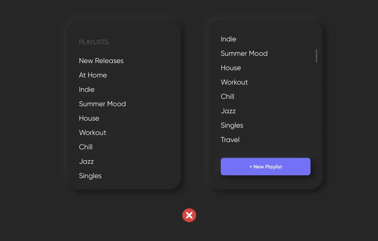
But what happens when the user creates a long playlist? The button will drop to the bottom and won’t be visible the next time the app is opened.
The principle of locality states that an important element must not be moved to where it’s no longer visible.
7. Avoid long registration forms
Large forms should be divided across several screens to be filled out step-by-step. Forms must only require the information that is absolutely necessary. To speed up and simplify the filling-out process, you can use autosuggest, “forward” and “back” thumb buttons, and avoid the scrollbar.
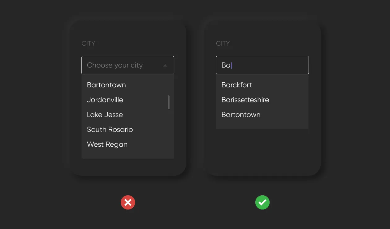
8. Avoid dropdown lists
Dropdown lists are not a good idea in an app. They require lots of clicking and scrolling, which is annoying and time-consuming. Long lists don’t fit on the screen and can be disorienting. It’s best to find an alternative to dropdowns. A limited choice can be represented by icons, while a long list can utilize typeahead.
9. Text
All in-app texts should be brief, simple, and legible.
Legibility
To be easily legible without zooming in, text must be in contrast against the background and be no smaller than 11pt. Legibility significantly depends on the font, line spacing, and kerning.
Brevity
Don’t try to cram as much text as possible onto the screen. The less text there is, the more comprehensible it becomes. This also applies to user-entered text. It’s best to use autosuggest in forms to minimize the amount of information that is entered manually.
Replacing text with images
Wherever possible, text should be replaced with visual clues. For example, instead of written instructions, use a short video or simple illustrations.
10. Testing
You should always test your project to receive independent user feedback and make sure your app is used the way its designers and developers meant it to be used.