How to Make Your B2B SaaS Brand Visually Recognizable
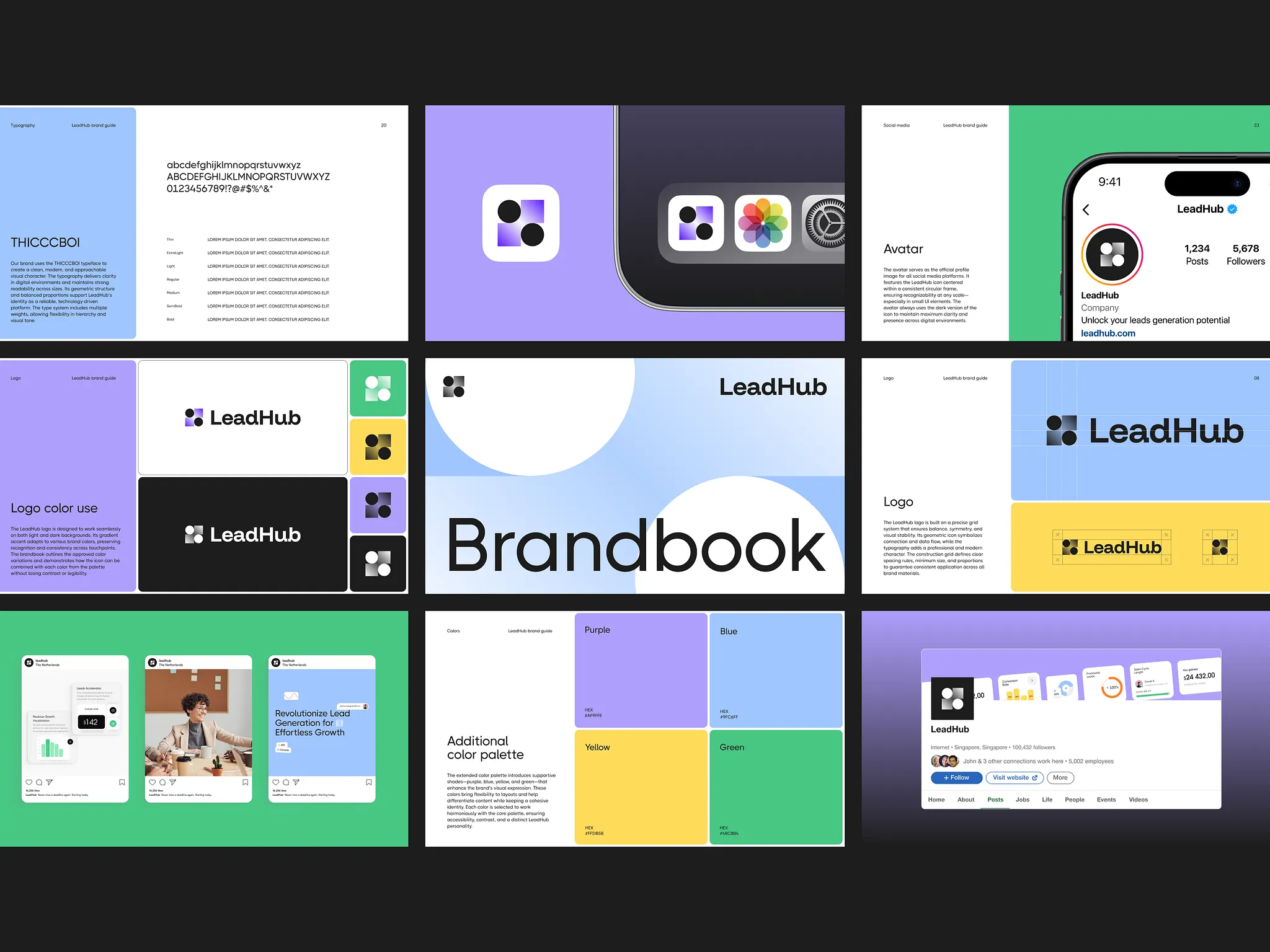
B2B SaaS has a strange problem. Companies want to look professional, and often end up drawing from the same visual playbook.
Clean sans-serifs. Soft blue or purple gradients. Dark or very minimal backgrounds. Product interfaces framed inside polished cards. Geometric graphics and abstract tech imagery. None of these choices is bad on its own. But when too many of them appear together, one polished SaaS brand can start to look a lot like the next.
The problem starts when the whole visual identity is built from a ready-made idea of what SaaS is supposed to look like.
The good news is that standing out does not mean turning a serious B2B product into a design experiment. In most cases, a few deliberate choices are enough.
1. Start by looking at the whole category
Before you create your own visual identity, it helps to understand which visual territories are already crowded.
Collect 10 to 15 direct competitors and look at them as one group.
Pay attention to:
- dominant colors;
- typography;
- photography, 3D, illustration, or abstract graphics;
- recurring shapes and compositions;
- visual metaphors that already feel overused.
The goal is not to do the exact opposite of everyone else.
If nine competitors use blue, that does not mean you suddenly need fluorescent orange.
It is more useful to spot the places where the whole category starts to look suspiciously similar.
Quick tip: use AI for the visual audit
Instead of reviewing every competitor manually, collect screenshots and give them to a multimodal AI model.
Ask it to classify:
- color palettes;
- typography;
- image style;
- recurring graphic elements;
- common visual patterns.
Then ask a second question:
Which visual choices are overused here, and which territories seem underexplored?
This does not replace a designer. It simply makes the early research much faster.
One thing matters here: do not start with, “How can we look unique?”
First show AI what you are trying to be different from.
Tools to try: ChatGPT can work with uploaded images and use visual context across a conversation, which makes it useful for comparing competitor screenshots and grouping recurring patterns.
ChatGPT Images

2. Do not try to make everything unique
One of the most common mistakes is trying to make the logo, typeface, palette, graphic system, illustration style, motion, and composition all distinctive at once.
The result is often visual noise rather than recognition. In practice, recognition works in a much simpler way. A brand chooses one or two strong visual assets and repeats them consistently.
For example:
- a distinctive palette and typography;
- a custom graphic motif and illustration style;
- a specific approach to photography and composition;
- a recognizable shape system combined with motion.
The important word here is repetition.
People do not remember how many creative decisions you made. They remember the elements they keep seeing across the brand.

3. Look for the visual language inside the product
Generic SaaS branding often starts with the same sources of inspiration: Pinterest, Behance, and lists of “best SaaS websites.”
Those references can be useful, but a better place to look first is the product itself.
Look at what is genuinely characteristic about it:
- data;
- relationships between objects;
- workflows;
- maps;
- timelines;
- layers;
- nodes;
- signals;
- recurring UI shapes;
- specific user actions.
Any of these can become the source of a visual system.
This is how a brand stops looking like “a modern tech company” and starts looking like this particular company.
It is especially useful for complex B2B SaaS products, where there may be no single obvious metaphor.
You do not have to illustrate the product literally. Sometimes it is enough to take its internal logic and turn that logic into a graphic principle.

Quick tip: explore the same idea in radically different visual territories
Once you have found something characteristic in the product, use AI to see how that idea behaves in different visual languages.
The same underlying concept can be explored as editorial graphics, technical diagrams, geometric compositions, tactile imagery, photography, or something intentionally low-tech.
The goal is not to choose whichever generated image looks nicest. It is to discover which territory has enough room to become a system.
Tools to try: ChatGPT Images works well for conversational visual exploration and iterative changes. Adobe Firefly and Midjourney both support reference-based workflows for exploring a consistent visual direction.
Adobe Firefly
Midjourney Style References

4. Do not confuse professional with neutral
B2B teams often avoid expressive design because they are afraid of losing credibility. So they choose the safest possible option.
But a professional brand does not have to be a quiet brand.
Trust comes from:
- consistency;
- quality of execution;
- a clear system;
- attention to detail;
- the feeling that nothing is there by accident.
A bright color does not make a brand unprofessional.
Neither does unusual typography.
Even humor or an unconventional visual idea can work perfectly well in an enterprise context if the overall system feels controlled and intentional.
A useful rule is simple: make one part of the system louder, and keep the rest calmer.
If the typography is highly expressive, you may not need five colors and three illustration styles at the same time.
If the palette is bold, the composition can stay simple.
If the graphics are complex, the typography and background can be restrained.
That gives the brand character without turning it into a circus.
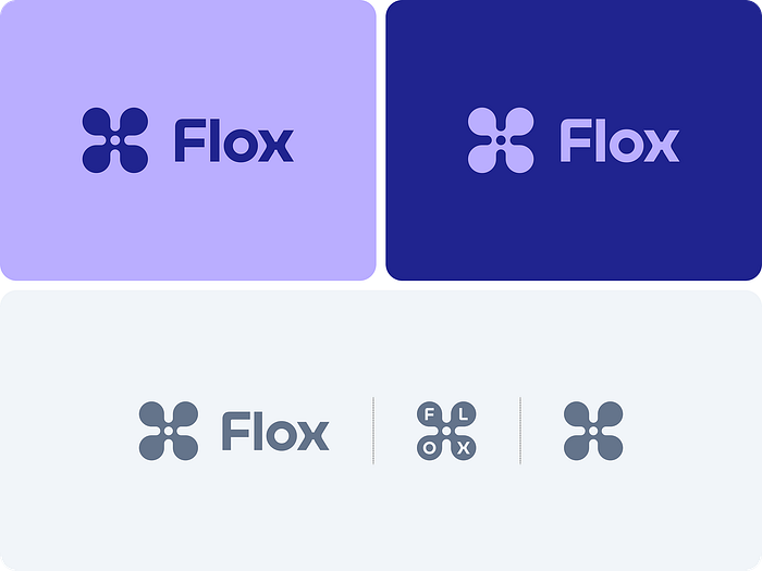
5. Build a system, not a collection of pretty images
A recognizable visual identity has to survive the homepage.
It should still work in:
- social media;
- sales decks;
- ads;
- case studies;
- conference materials;
- email;
- reports;
- small banners.
That is why a good brand system answers more than “What does this look like?”
It also answers, “What are the rules?”
For example:
- which color combinations are allowed;
- how shapes are used;
- how images are cropped;
- how illustration behaves;
- how compositions are built;
- how much graphic detail is too much;
- what the brand never does.
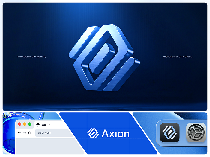
Quick tip: make the rules usable by AI
A brand guide is no longer only a PDF for people.
Some rules can now be made clear enough for AI tools to follow as well.
For example:
- use only approved color pairs;
- keep key shapes within defined proportions;
- follow one composition logic;
- apply a specific image treatment;
- avoid certain visual devices altogether.
The clearer the system is, the easier it becomes to scale without constant manual correction.
Tools to try: Adobe Firefly Style Kits can preserve prompts, style references, and generation settings for a team. Firefly Custom Models can go further by learning a specific illustration, photographic, or iconographic style from approved examples.
Firefly Style Kits
Firefly Custom Models
Canva can also apply Brand Kits to AI-assisted design generation, which can be useful for simpler day-to-day marketing production.
Canva Magic Design

6. Use AI to stretch a direction, not to define the identity
AI is excellent at generating options. That is also why it can produce a remarkable amount of average-looking work.
If you ask:
“Create a modern, innovative B2B SaaS visual identity.”
there is a good chance you will get exactly the kind of design you were trying to escape.
AI is much more useful as a tool for divergence.
You can use it to explore several clearly different territories:
- editorial;
- technical;
- data-driven;
- tactile;
- geometric;
- photographic;
- intentionally low-tech.
The designer still chooses the direction and builds the system.
AI simply makes it faster to see what happens when the idea moves in different directions.
Quick tip: use a reference set instead of writing longer prompts
Once the visual direction is established, there is no need to explain it from scratch every time.
Build a small set of approved examples and use them as style references.
This helps AI invent less “SaaS” and follow more of the visual logic you have already defined.
Adobe Firefly lets you use a reference image to control the style of generated variations and adjust how strongly the reference affects the result. Midjourney offers a similar Style Reference mechanism focused on the overall visual feel rather than copying the content of the reference itself.
Firefly Style References
Midjourney Style References
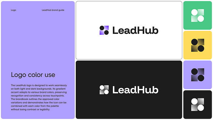
7. Test whether the brand is actually recognizable
There are a few very simple ways to do this.
The logo-off test
Remove the logo and the company name.
Is there still something recognizable left?
If the result is just “a nice SaaS brand,” the visual system is probably not strong enough yet.
The competitor swap test
Take your gradient, illustration, hero graphic, or shape system and imagine placing it on a competitor’s website.
If it fits there perfectly, it may not be a brand asset at all. It may simply be a category convention.
The AI clustering test
You can push this a little further.
Mix several of your own visual assets with assets from competitors. Remove the logos and ask a multimodal model to group them by visual similarity.
Then ask it to explain the grouping: color, composition, typography, shapes, image style, or some other repeated cue.
If your work keeps landing in the same cluster as two or three competitors, look at the cues that caused it.
This is not a scientific recognition study, and it is not a substitute for testing with real people.
But as a quick internal check, it can be useful.
Tool to try: a multimodal conversational model such as ChatGPT is useful here because it can analyze several uploaded visual references together and discuss the reasoning behind the grouping.
8. Scale only after the identity is distinctive
AI is already very good at creating variations, resizing assets, adapting formats, and producing new materials based on an existing system.
But one principle matters:
AI scales whatever you give it.
If the brand is generic, AI will help you produce generic design faster.
If the brand already has a clear visual language, then AI becomes genuinely useful. It can help preserve the style and extend the system without rebuilding every asset by hand.
Figma, for example, is adding AI workflows that can preserve existing layouts, styling, and selected brand constraints while producing new variations.
Adobe Firefly Custom Models are designed for a similar problem at larger scale: generating new visuals while carrying over a learned brand aesthetic, including palette, patterns, and illustration style.
So the sequence should be:
distinctive idea → visual system → AI scaling
Not the other way around.
Distinctive does not mean disruptive
A B2B SaaS brand does not need to break every category convention to become recognizable.
Distinctiveness comes from knowing which visual choices have become generic, choosing a few elements the brand can truly own, and using them consistently across different formats.
AI can help map the field, explore directions, and scale a system that already works. But it should support the thinking, not replace it.
Do not ask AI to invent your identity. Give it an identity worth scaling — one grounded in the people who use the product and what they are trying to achieve.
The more closely we pay attention to our users’ goals, habits, and frustrations, the easier it is to make visual choices that feel relevant rather than decorative. A clear, structured visual system helps people process information faster, navigate complexity, and get things done with less effort. And when a brand makes a complex product feel clearer and easier to work with, that is the kind of experience people tend to remember.