How to Decide What Your Financial Dashboard Actually Needs in 2026
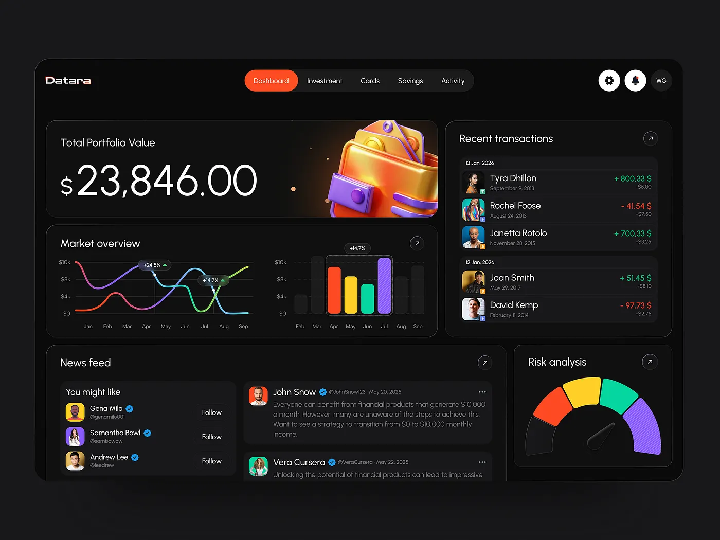
A financial dashboard should not answer every possible question. It should help the right user answer the most important one, faster.
Simple in theory. Easy to lose in practice.
In 2026, finance teams are under pressure to move faster. AI is moving deeper into finance workflows. Digital expectations keep rising. And trust depends on more than compliance alone.
That makes dashboard decisions harder. More features, more logic, and more intelligence can make a product look stronger while making it less useful.
The real challenge is knowing what your dashboard actually needs and what it can do without.

Start with three questions, not with trends
Before choosing patterns, features, or visual structure, define three things first.
1. What decision should this dashboard support first?
This is the most important question, and the one teams skip most often.
Is the dashboard meant to support cash control, performance visibility, fraud monitoring, forecasting, investor reporting, spend oversight, or risk spotting?
Without a clear decision job, dashboards turn into storage units for metrics. Teams keep adding charts, filters, widgets, and summaries until the interface starts reflecting the system instead of the user’s priorities.
The first screen should not try to answer every possible question. It should help the user answer the most important one faster.
2. Who is the main user?
A founder, CFO, finance manager, analyst, operations lead, and retail investor may all care about the same numbers. But they do not read them the same way.
A founder may want a quick answer about burn, runway, or an unexpected shift. A finance team may need detail, drill-downs, and comparison. A CFO may care less about raw visibility and more about forecasting, scenario planning, and confidence in the assumptions behind the numbers.
This is one reason universal dashboards often feel bloated. They are designed for everyone and end up prioritizing no one.
The more roles your product serves, the more important it becomes to define defaults, hierarchy, and views around actual user goals instead of a generic dashboard experience.
3. How fast does the answer need to appear?
Some financial questions require real-time visibility. Others support weekly review, monthly reporting, or strategic planning.
This matters because speed is not just a technical metric. It changes the structure of the interface.
A dashboard built for fast control needs a different first screen than one built for planning and comparison. In one case, surfacing anomalies and urgent changes may matter most. In the other, users may need assumptions, context, scenario views, and cleaner comparison states.
If you skip these three questions, every trend starts to look equally important. It is not.

Why this question got harder in 2026
The challenge is not only internal product complexity. The category itself is shifting.
Financial dashboards are being pulled in several directions at once. They need to support faster decisions, more intelligent workflows, stronger trust signals, clearer fraud response, and better personalization without becoming invasive or chaotic. AI is raising expectations, but also increasing the need for explanation and control. Users want speed, but they also want predictability. Teams want smarter products, but they cannot afford UX that feels vague in high-stakes environments.
That is why the question is no longer “what features should we add?”
The better question is: which shifts actually matter for this product, this user, and this decision environment?
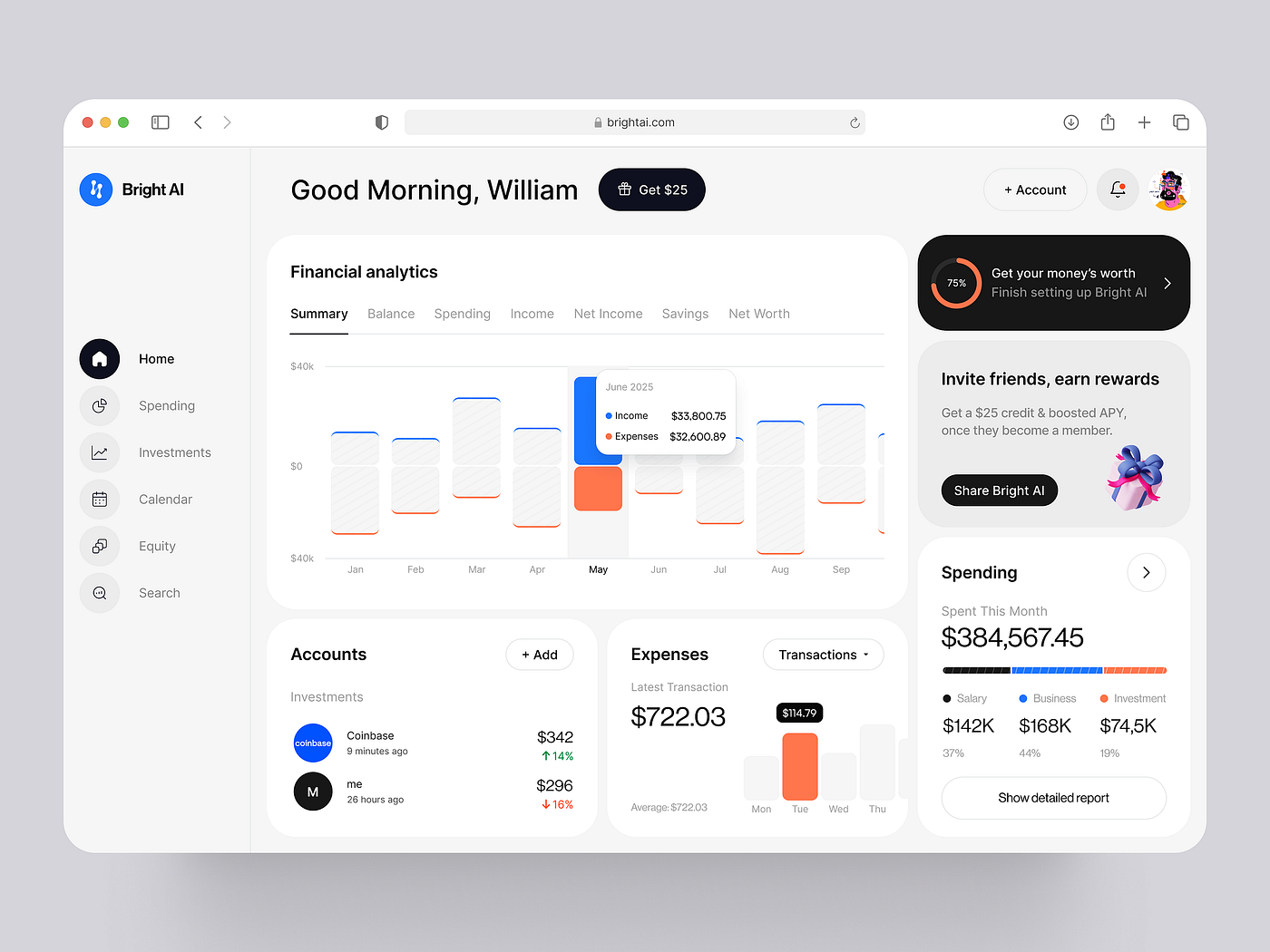
The trends that should shape your dashboard decisions
Trends help, but only if you use them selectively. They matter because they are reshaping what a financial dashboard is expected to do.
1. From reporting surface to decision tool
This shift matters most.
A financial dashboard no longer earns its place by showing what happened. It has to help users decide what to do next.
That does not mean every dashboard needs predictive AI or automated recommendations. It means the interface should support judgment, not just display output.
In practice, this leads to stronger hierarchy, clearer first-screen priorities, cleaner escalation paths, and fewer decorative or redundant elements. The dashboard becomes less of a mirror and more of a guide.

2. AI becomes part of the workflow
AI in finance is no longer a speculative feature. It is moving into operational reality.
For dashboard design, this does not mean adding a chatbot and calling it innovation.
The useful version of AI is usually quieter. It helps summarize movement, surface anomalies, flag risks, shorten analysis time, and reduce the amount of manual digging needed before a user reaches a decision. The best AI layer often feels embedded rather than announced.
So the design task changes too. Instead of asking where to place the AI, teams should ask where users are still doing repetitive interpretation work that the system could support more intelligently.
3. AI needs explanation and control
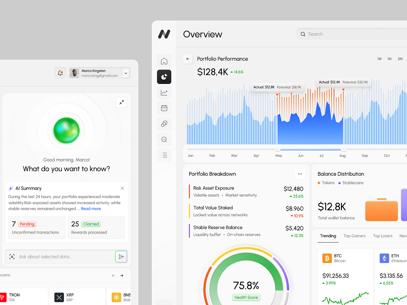
As soon as AI starts shaping recommendations, highlighting patterns, or tailoring what the user sees, explanation becomes part of the product.
This matters even more in finance, where users need to judge the reliability of outputs, not just consume them. If the system affects a financial decision, people need enough reasoning context to understand and evaluate what they are seeing.
That does not require long technical breakdowns. Usually it means plain-language rationale, confidence indicators where appropriate, visible assumptions, and controls that let users adjust, question, or turn off automation when needed.
If AI affects a financial decision, the “why” cannot be hidden in settings.
4. Trust and fraud response now shape product UX
Security is no longer just an infrastructure topic. It is part of the experience layer.
Users judge financial products not only by whether they are secure, but by whether the product feels understandable and dependable when risk appears. Clear communication, fast response, and visible support are becoming part of the trust equation.
For dashboard design, that means clearer status communication, better alerts, cleaner recovery flows, more understandable verification moments, and less chaotic warning behavior. The goal is not to make security louder. It is to make confidence stronger.

5. Personalization only works when it is transparent
Financial dashboards rarely benefit from being completely universal. A CFO and a retail investor should not be dropped into the same decision environment. Different roles need different defaults, different summaries, different depth, and sometimes different logic.
In finance, data access and user consent are not side concerns. They shape whether personalization feels useful or invasive. Products need clearer data-use explanations, stronger permission logic, and settings users can actually understand.
Personalization should make the interface feel more relevant, not more watchful.

6. Ask-first interfaces are growing, but they should complement structured analysis
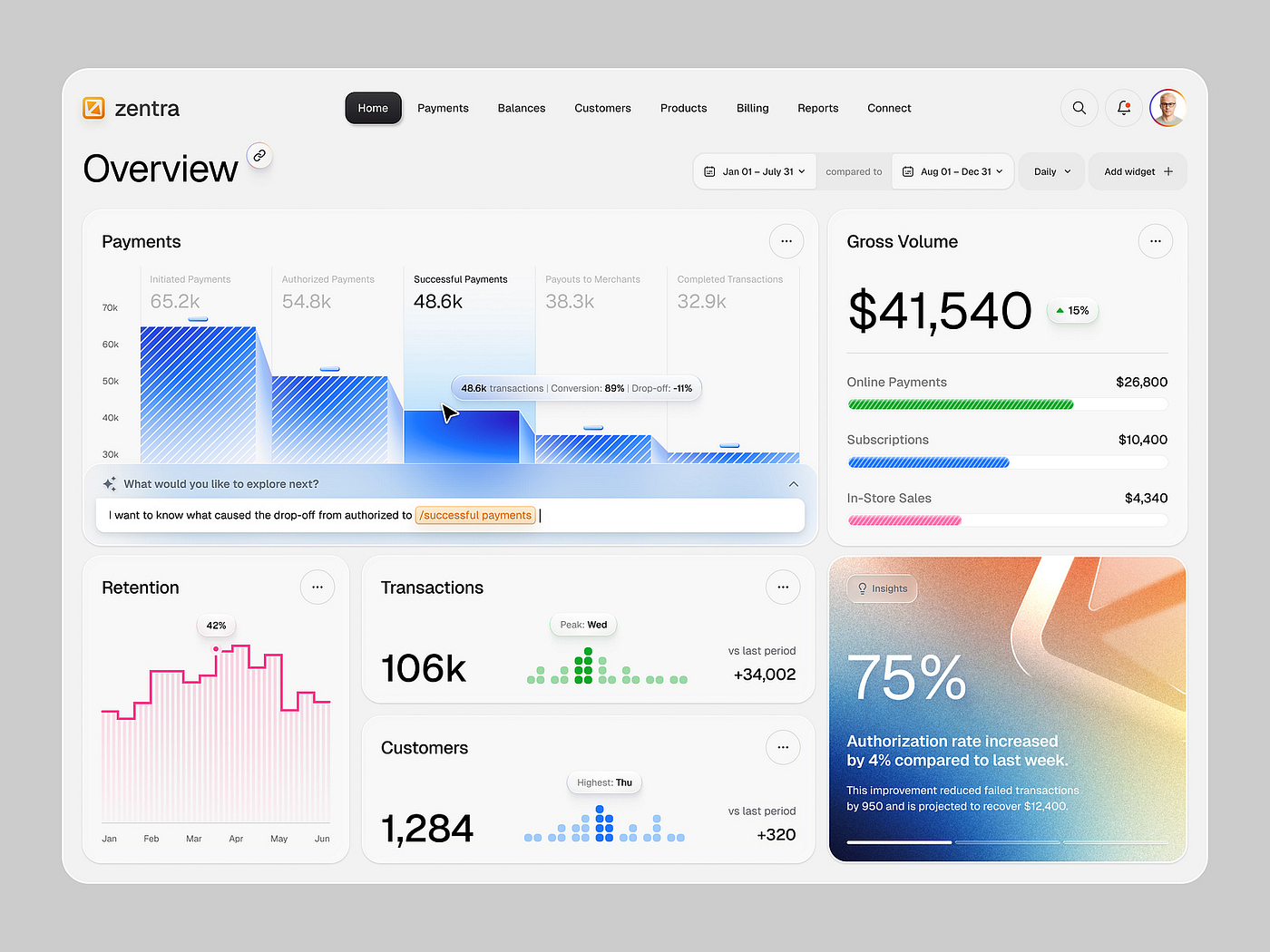
AI is pushing digital interfaces toward more intent-based interaction, where users describe what they want instead of navigating every control manually.
That matters for financial dashboards. In some cases, it is now easier to ask a question than to click through layers of filters and menus to find an answer.
But this does not make traditional analysis patterns obsolete. Structured controls, filters, tables, drill-downs, and comparison views still matter, especially in high-stakes or audit-heavy workflows.
A hybrid approach makes more sense. Use ask-first patterns for speed, exploration, and quick retrieval. Keep structured analysis where precision, repeatability, and control still matter.
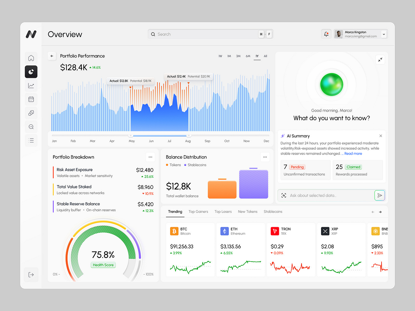
What users actually expect from financial dashboards in 2026
Once the decision, user, and response speed are clear, the real expectations become easier to see.
These expectations grow out of the same shifts at product level.
Clarity
Users want to understand what changed, why it matters, and what needs attention now.
This sounds obvious, but it is still where many dashboards fail. They display the state of the system without helping users interpret it. In financial products, that gap is expensive. A number moves, but the user still does not know whether to act, wait, investigate, or ignore it.
Clarity starts with prioritization. It means fewer competing elements on the first screen, better hierarchy, sharper labeling, and more useful summaries. It also means resisting the urge to show everything at once just because the system can track it.

Trust
Trust in finance is shaped by more than brand or compliance language.
It is influenced by how predictable the product feels, whether alerts make sense, whether errors are understandable, whether recommendations can be evaluated, and how the product responds when something goes wrong.
This has become more urgent as fraud response increasingly affects switching behavior and as digital quality becomes a larger part of satisfaction in banking. When users lose confidence in security or do not trust the product’s behavior during a high-stakes moment, the experience problem quickly becomes a retention problem.
Relevance
Users do not want more data. They want the data that matches their role, task, and moment.
This is where personalization becomes useful. But in finance, relevance only works when it is transparent. The more financial products rely on connected data, third-party access, and personalized logic, the more important it becomes to explain how the system works and why certain information is shown.
Users want relevance without creepiness, protection without friction, and insight without guesswork.
Control
As products become more intelligent, users still want to feel that they can verify, question, and guide what the system is doing.
This applies to AI recommendations, automated summaries, anomaly detection, fraud-related actions, and role-based personalization. Users may welcome assistance, but they still need visibility into the reasoning, enough confidence to act, and enough control to correct the system when needed.
In financial UX, control is not a nice extra. It is part of trust.

How to translate these shifts into actual UX/UI decisions
Once the trends and expectations are clear, the design decisions get easier to make.
If the dashboard’s main job is fast control, prioritize a strong first screen, anomaly visibility, clear status cues, and minimal friction between issue detection and action.
If the dashboard’s main job is planning and forecasting, prioritize historical context, scenario views, assumptions, comparison states, and explanation around projected outcomes.
If the product’s main challenge is trust and retention, prioritize predictability, recovery flows, fraud communication, explainable logic, and calmer, clearer language across high-stakes moments.
If the product serves multiple roles, prioritize role-based defaults, modular structure, permission-aware views, and progressive disclosure instead of one overloaded interface.
If AI is part of the workflow, decide what repetitive interpretation work it should actually reduce. Then design the support around that job. In many cases, AI should summarize, highlight, or shorten the path to judgment rather than compete with the whole interface.
If ask-first interaction makes sense, use it where it improves speed and discovery. Keep structured analysis where users still need precision, repeatability, and explicit comparison tools.
Patterns only help when they fit the decision environment.
What not to do
A few mistakes are especially common right now.
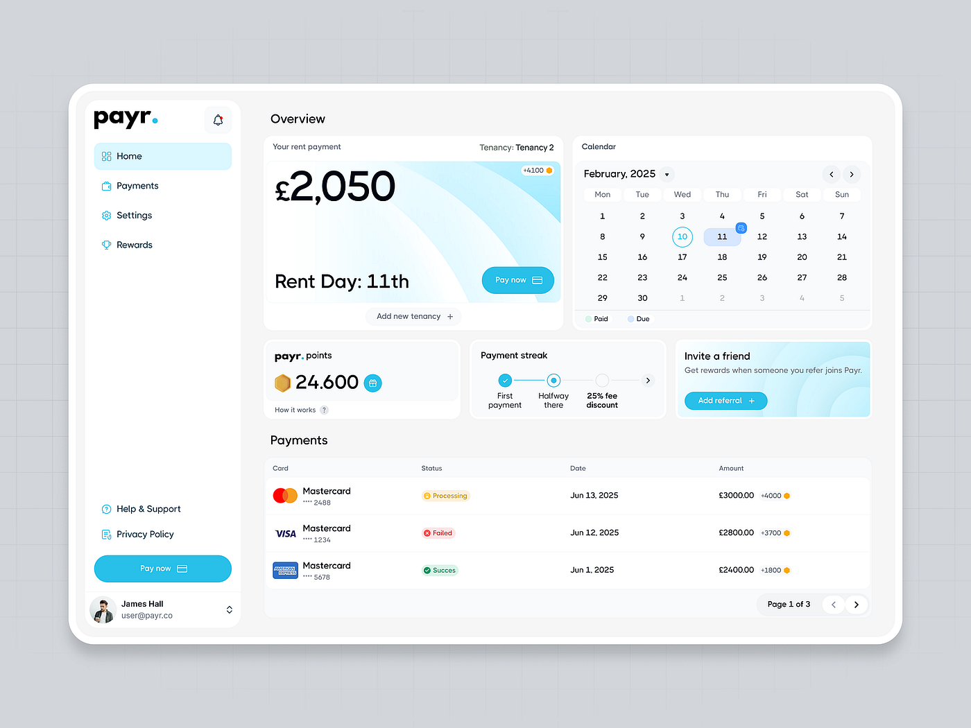
- Do not start by putting every available metric on one screen.
- Do not add AI without deciding what repetitive interpretation work it is actually supposed to reduce.
- Do not treat personalization as automatic value. In finance, unexplained personalization can damage trust faster than it improves relevance.
- Do not confuse visual novelty with product quality. A dashboard can look sophisticated and still slow users down.
- Do not assume that chat or natural-language entry should replace every structured control. In many finance workflows, users still need precision, consistency, and explicit comparison tools.
The real standard for 2026
So how do you decide what your dashboard needs in 2026?
Start with the decision, the user, and the speed of response. Then choose only the patterns, AI support, and personalization logic that serve that context.
A strong financial dashboard in 2026 turns data into something users can quickly understand and act on. That takes more than good presentation, but it reflects what users actually need. In financial products today, it also reflects where market expectations are moving.
New trends are easy to get excited about. A smarter interface, a new AI feature, a cleaner way to surface data — all of it can look like progress.
Sometimes it is. But teams also adopt what looks modern without being clear about what it improves. That is how dashboards end up with more widgets, more controls, more summaries, and more visual polish, but not more usefulness.
In finance, that gap matters more than in most products. A dashboard can look advanced and still make work slower, decisions harder, and trust weaker.
Trends only help when they support a real job. What matters is what your dashboard needs to help people make better decisions.
You may also find this helpful:
Dashboard That Works: A Step-by-Step Guide for Startups