From Confusing UX to Market Traction: Redesigning a Complex B2B SaaS
What happens when a product built to simplify a complex workflow becomes difficult to use itself?
Dripify entered the crowded LinkedIn automation market with an ambitious idea: bring the tools sales teams need into one flexible, easy-to-manage platform. But its early UX made that advantage difficult for users to see and fully use.
This case study shows how Dripify and Outcrowd reworked the product experience, and which design decisions helped the platform compete and grow in an established market.
1. Before & After
In its early days, Dripify had a strong product idea but struggled to communicate it. The website didn’t clearly explain how the platform differed from established tools, while the product UX made its broad functionality harder to discover and use.
Today, Dripify brings LinkedIn and email outreach, sequence building, personalization, analytics, lead enrichment, team management, and other sales tools into one platform. Just as importantly, the experience has become one of its strengths: users consistently highlight Dripify’s ease of use, intuitive interface, and straightforward campaign setup.
Getting there required more than a visual refresh. Dripify reworked its branding, website, and product experience to make the original idea behind the platform clear and usable at every step.
2. Facing Countless Competitors
Dripify entered an already mature and highly competitive outreach market. More importantly, almost every capability it planned to bring into one platform already had its own established tools.
To get a sense of the competition:
LinkedIn automation: Expandi, Waalaxy, Salesflow, Dux-Soup, We-Connect, Meet Alfred, ProspectIn, Zopto, Linked Helper, Prospect Maximizer, PhantomBuster, Aimfox, Zaplify, Overloop, Kaspr, Amplemarket, Evaboot, LaGrowthMachine, LeadDelta.
Email automation: Apollo, Outreach, Snov.io, Saleshandy, Lemlist, Yesware, Woodpecker, Mailshake, Reply.io, Klenty, Kaspr, Instantly.
Email finders: Hunter, EmailSearch, Skrapp, FindThatLead, Voila Norbert, RocketReach, Nymeria, Lusha, GetProspect, AeroLeads.
Message hyper-personalization: Lyne, Smartwriter, Warmer, Quicklines, OutboundFlow, Copy.ai, Writi, Botowski, Hypotenuse AI.
Dripify was not entering a market with an obvious empty space. It was entering one where users already had familiar tools for nearly every task it wanted to cover.
3. The Idea and How to Deliver It
Dripify was not trying to invent an entirely new set of sales tools. Most of the capabilities its users needed already existed in established products such as Apollo, Snov.io, Expandi, and others.
The opportunity was to bring those familiar capabilities together in one platform and make the overall workflow simpler, more convenient, and more cost-efficient for small sales and marketing teams.
The problem was that the old website did not communicate this clearly. It listed features, but failed to show why having them work together in one product was valuable or how Dripify could replace several separate tools in a team’s workflow.
That is why Dripify’s CEO came to Outcrowd for a comprehensive redesign. The goal was to rethink the brand, website, and product experience so that the platform’s core value was not only visible, but easy to understand and use.
4. Thoughtful Branding
In a crowded market, a brand has to be recognizable and easy to understand, to make it clear why you’re the better choice. That’s what branding is for, and that’s exactly where we began.
Our approach to branding was built on simplicity and clarity. The client’s key requirement for the brand refresh was to modernize the look without driving away existing users.
Logo
The logo needed to feel simple and modern while still reflecting Dripify’s core product idea.
One of Dripify’s core features is a flexible, comprehensive automation sequence builder. In the saturated LinkedIn automation market, Dripify focused on what matters most: sequences and their automation, which account for 90% of the time spent working with the tool. This focus is what we reflected in the logo.
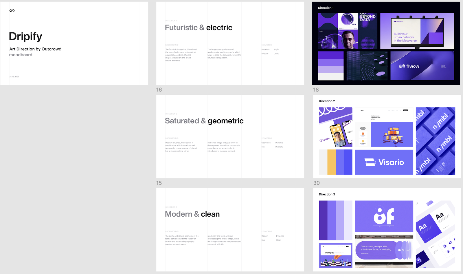
As usual, we started with moodboards. B2B SaaS doesn’t require “reinventing the wheel.” In shaping the art direction, William Grace relied on three factors:
- Familiarity — the new identity had to feel recognizable to both existing users and people already familiar with competing products
- Functionality (the startup’s Unique Value Proposition)
- Modernity (creating a distinctive, recognizable style and emphasizing the nature of a young startup)
After the client selected their preferred option, we moved to the Concept Exploration Stage. Here, we demonstrated how the newly developed art direction could be applied to the logo in various versions.
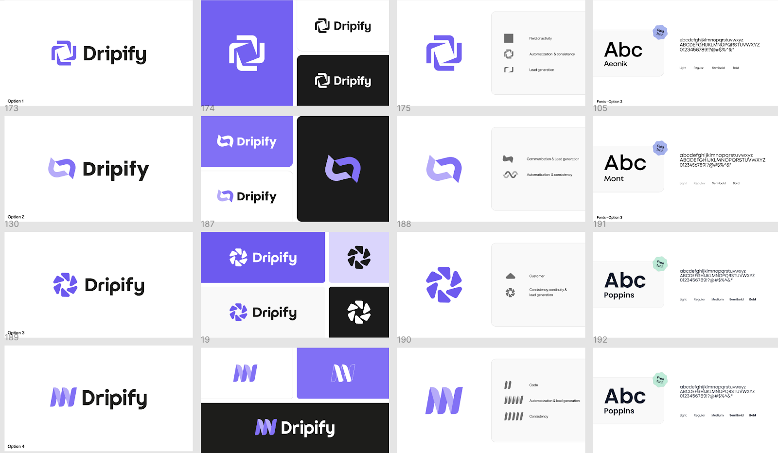
The client approved the logo, and it became the foundation for the entire brand book, guiding the development of color palettes and combinations, typography, and a range of brand elements for every brand touchpoint.
For Dripify, we created the logo, primary and secondary color palettes and combinations, custom typography, illustrations and imagery, iconography, social media banners and posts, an app icon, merchandise, and a business card.
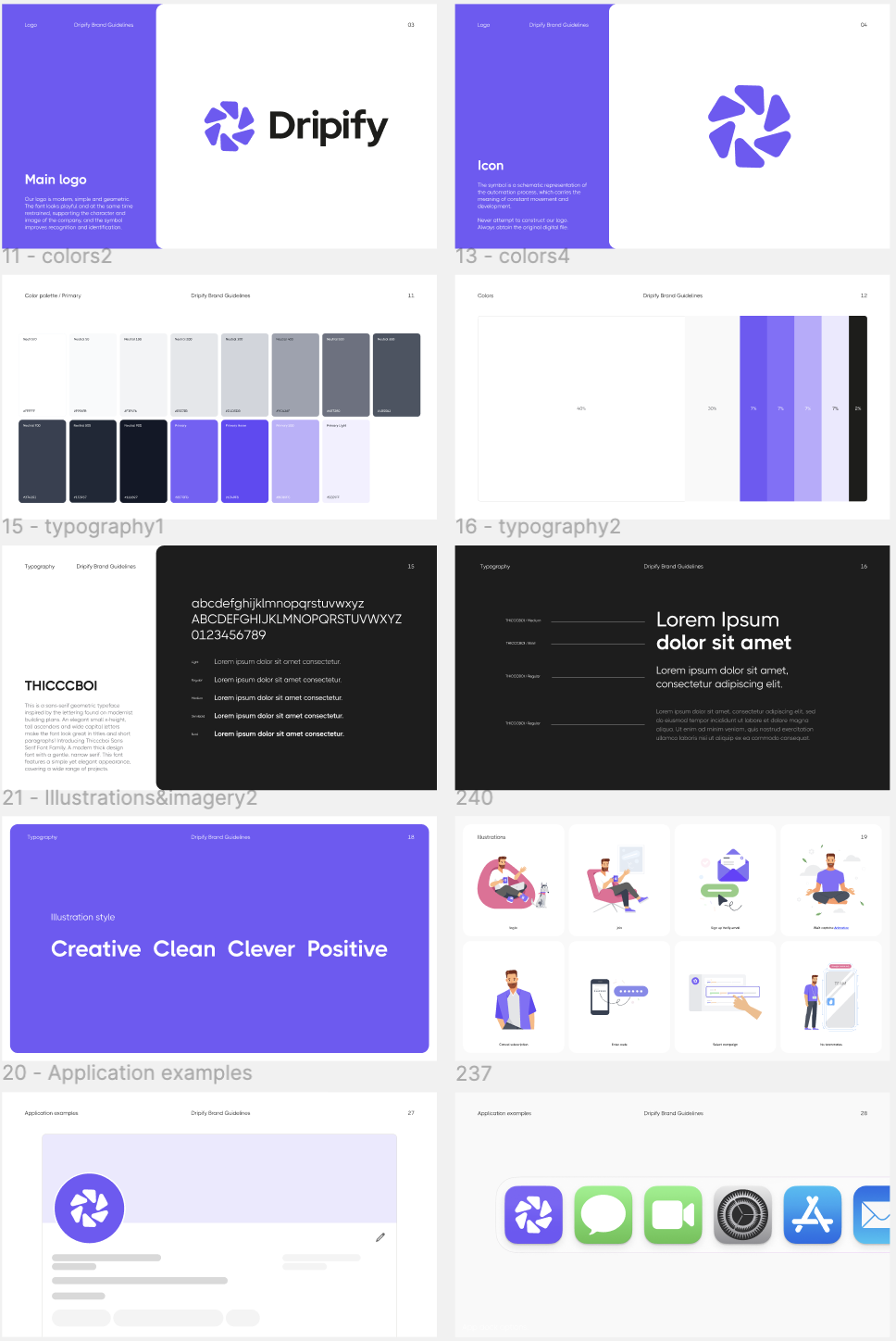
Visual Identity Feature
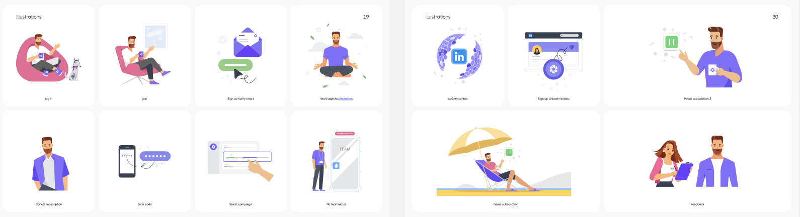
The automation industry is relatively new and far from conservative. Our client had the great idea to add a splash of color and a playful tone to the visuals to boost user engagement and create a distinctive brand identity.
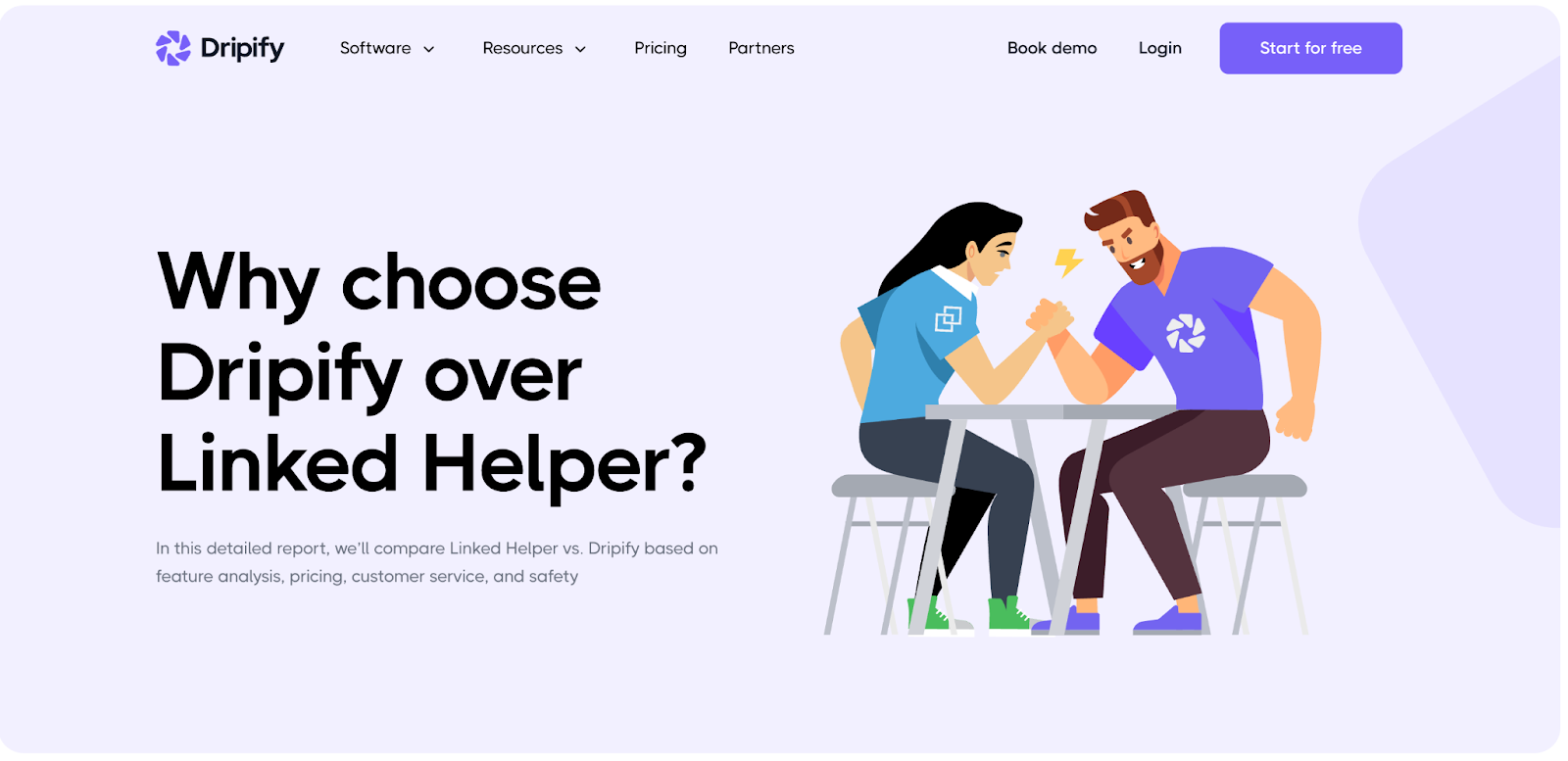
To bring this to life, we developed a unique illustration style. Today, these illustrations are featured across the product, website, and other Dripify resources as an integral part of the brand.
5. Website: showcasing benefits with maximum clarity
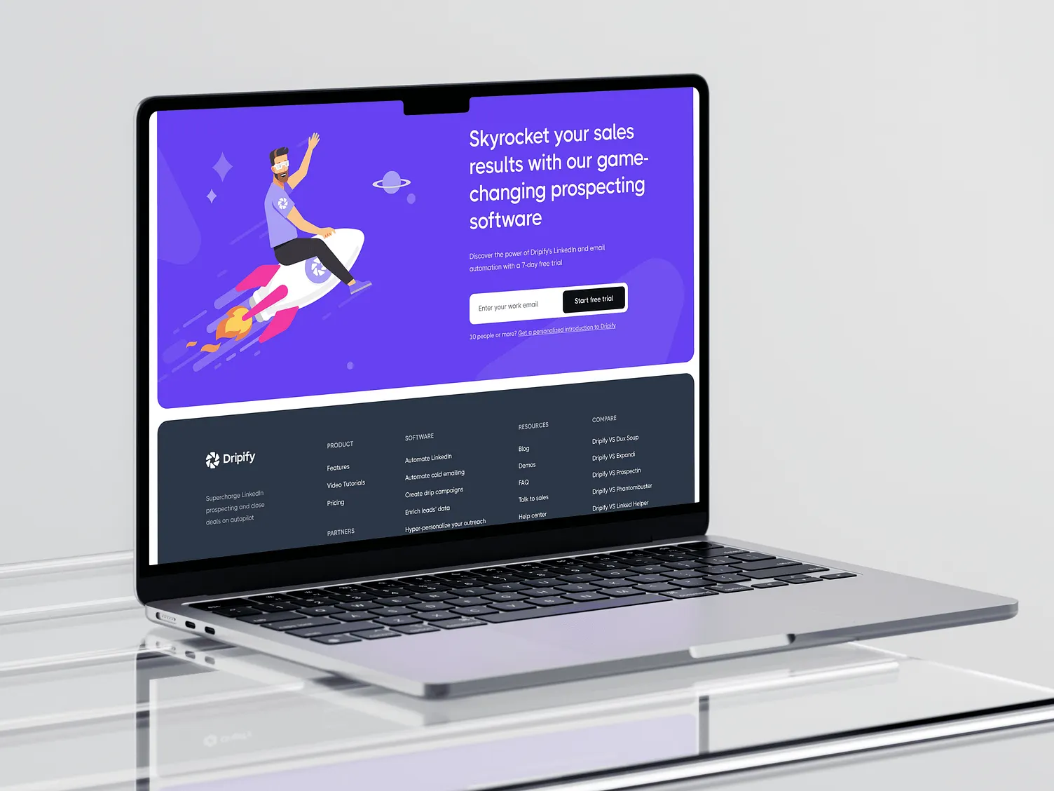
In its early days, Dripify’s website was uninformative and drove clients away with its outdated UI and poor UX. It failed to present Dripify as a universal sales and marketing assistant. At that time, many B2B SaaS industry prospects gave negative feedback about Dripify, preferring Expandi or LinkedIn Helper.
USP and Clear Presentation
We worked closely with Dripify’s marketing team. They provided a 72-page brief with a detailed description of the company’s positioning and all the necessary copy. Our role was to shape the structure and make UX/UI decisions.
Following SEO best practices, most companies presenting B2B products with broad functionality and multiple use cases choose a bento-style layout and templates. To save time and improve readability, they build a universal UX template for a feature and simply swap out static content from page to page.
Dripify’s website took a different route. Dripify’s value proposition was different from most competitors, and the team had already learned that generic feature descriptions weren’t enough.
That’s why the CEO was ready to invest significant resources into thoroughly describing and visually showcasing every part of the functionality. The goal was to help users understand the product before they reached the free trial, where confusion had often become a support issue.
Clear Product Presentation
The main reason users dropped off the old website was that they didn’t understand the product. People searched for a specific feature, SEO brought them to a Dripify page (often after market giants like Apollo), and they left without seeing why they should choose Dripify over better-known competitors.
The more unique or complex the USP, the simpler and more visual its presentation needs to be.
That’s why we chose a different approach. For each feature, we created a unique animation showing how it works. These animations gave potential subscribers ideas for how each feature could fit into their sales or marketing teams.
There are plenty of examples, and that’s intentional. The founder cared not only about the product itself, but also about making sure users understood its value without wasting time figuring it out on their own. That mindset shaped the website and, more broadly, Dripify’s approach to helping sales teams work more effectively.
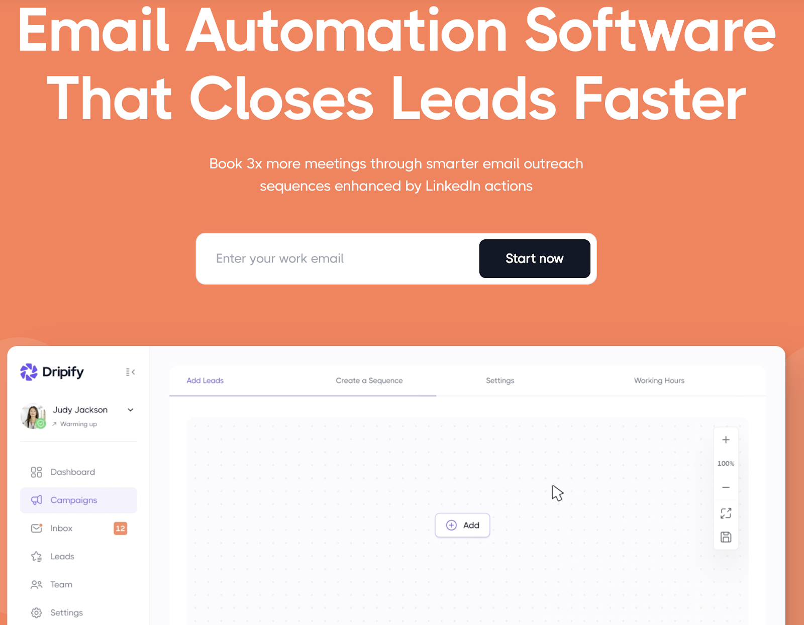
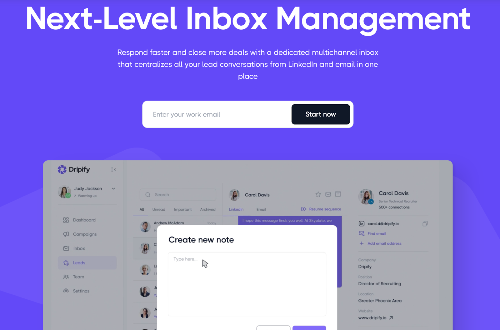
Our task was both simple and complex: to make sure that any targeted traffic landing on the site and showing interest wouldn’t leave without fully understanding how every part of the product could be applied in their company. That’s how the “Ultimate sales tool” was born. It lightens the load of time-consuming sales demos (though they’re still needed), increases the meaningful time spent on the site, and, of course, boosts sign-ups for the web app.
Reinforcing Competitive Advantages
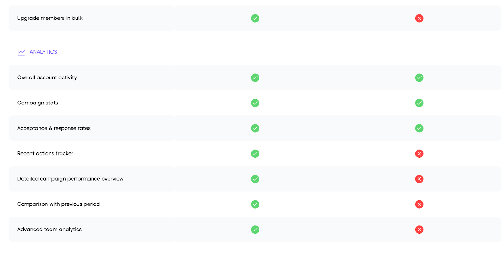
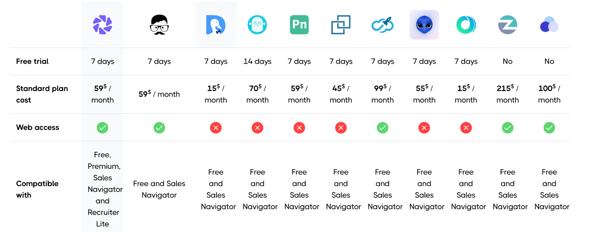
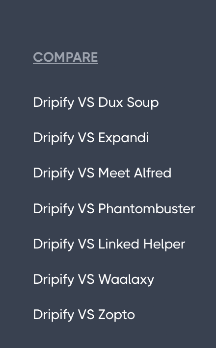
I’ve already mentioned the huge number of competitors. We took a particularly thorough approach to comparison by creating a custom page with the “Pros” and “Cons” of Dripify against each major competitor. This makes the value proposition clear and helps users understand the platform’s strengths: https://dripify.com/comparison/.
Navigation
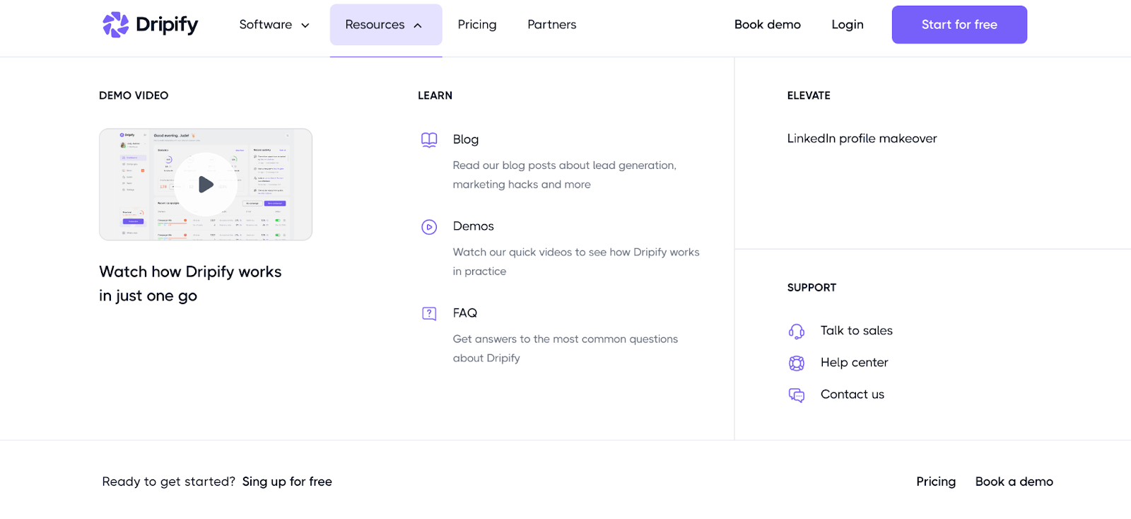
Another technical solution that improved both product understanding and usability was navigation. When opened, dropdowns now expand to cover almost the entire page, moving away from the typical, simple feature list.
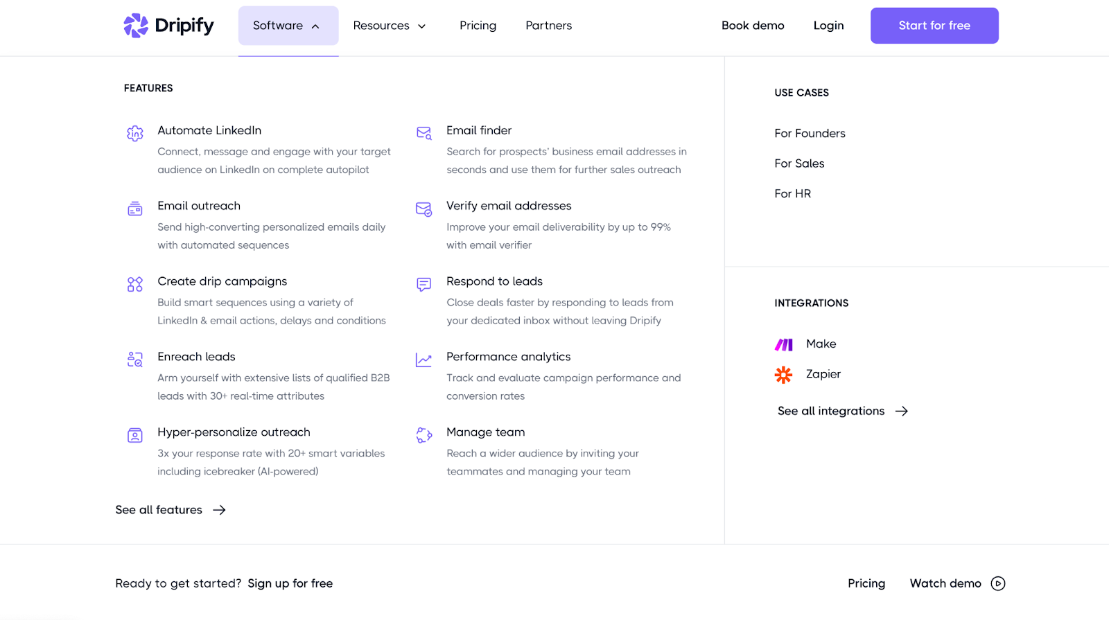
We even added a video to the Resources tab in the navigation bar. The goal was the same: to help users visualize and understand real use cases. The navigation also includes custom icons and short descriptions for each feature.
Website Visuals
Conceptually, the site needed to follow core B2B SaaS market trends, target a young and progressive audience, and rely heavily on custom illustrations to create stronger associations.
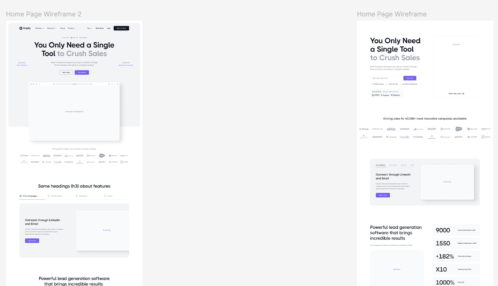
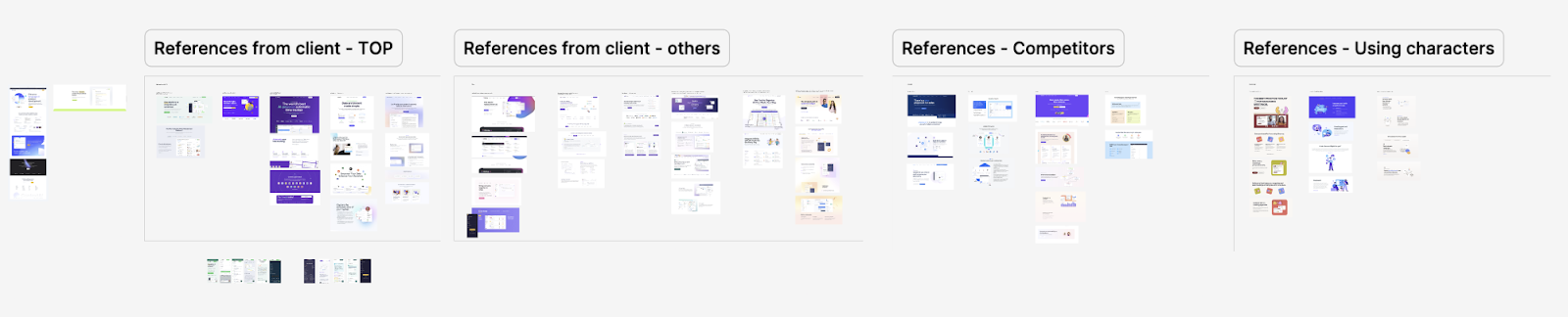
Based on the new branding, we built a moodboard that aligned with the brand guidelines and project goals. After a Concept Exploration session showing the homepage with the chosen wireframe and moodboard, we confirmed the direction and the main color accents in line with the brand book, then moved on to the other pages. Thorough early-stage discussions with the client on concepts, moodboards, and wireframes helped us deliver the design quickly and avoid unnecessary revisions.
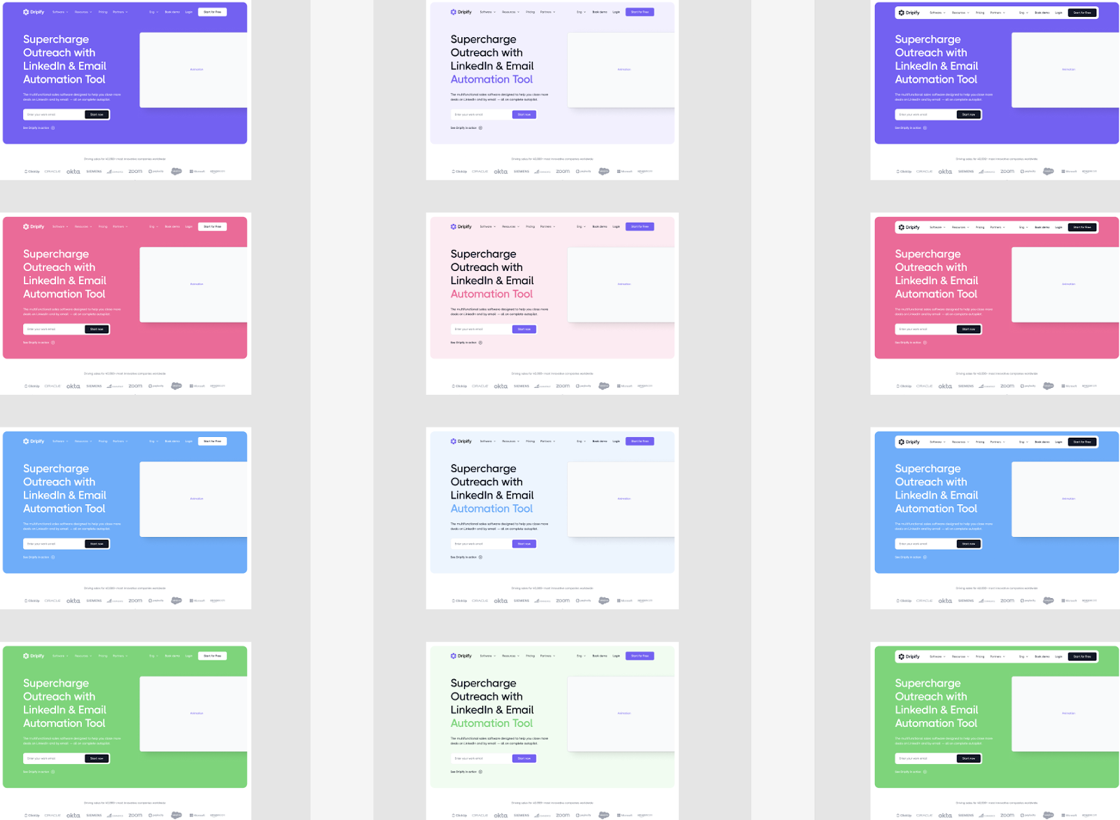
The Dripify website looks fairly simple and doesn’t aim for flashy Awwwards-style designs. Instead, it’s a comprehensive product resource that, despite its visual simplicity, presents a massive set of clearly explained use cases for the product.
This may not work for users who only need a sequence builder or lead enrichment. But for us, it’s the foundation of smart niching: we deliberately avoid untargeted users and present the product as clearly and convincingly as possible to the users who specifically need it. This kind of focus can pay off significantly over time, especially for segmented products that clearly understand their audience and their place in the market.
You can check out the site here: Dripify
6. Product
A product always represents the company, and its quality determines whether a startup will succeed or fail.
Product design requires a deeper level of research because every platform comes with its own market, users, workflows, and metrics.
Research
At Outcrowd, we know from experience how important UX research is to a product’s success. Understanding the target audience’s problems, habits, preferences, and behaviors is what makes design, development, and marketing decisions worth investing in. UI matters too, but it comes second.
In cooperation with Dripify’s CEO (name), we spent dozens of hours studying competitors, existing users, and the audience segments the new design was meant to attract.
Since this was a redesign, the founder already had a solid information base: the product itself, a large pool of feedback, and formulated hypotheses on where to take the platform next.
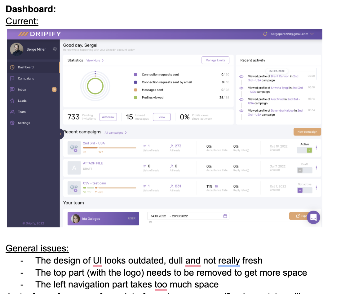
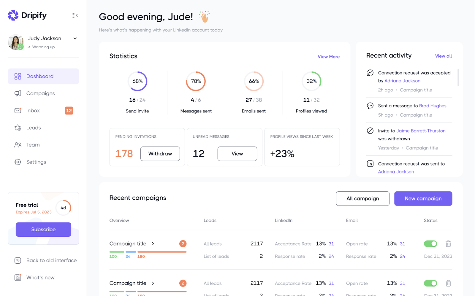
Dripify’s target user persona is a small, young U.S.-based tech team that doesn’t want to overpay for an entire software suite to run cold and warm outreach on LinkedIn. The main roles are sales, marketing, or a founder covering both functions.
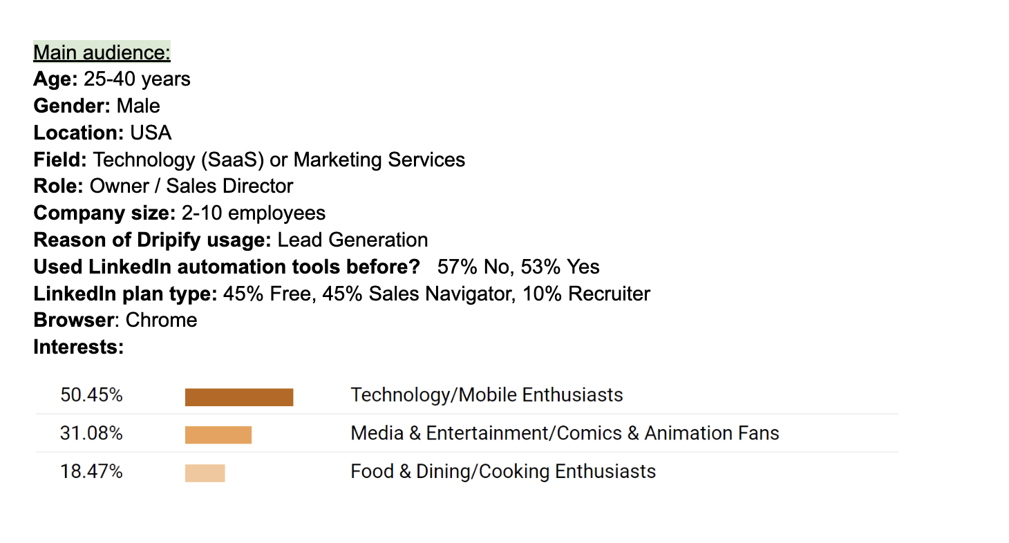
This type of audience gravitates toward multitools like Dripify because they simplify operations and deliver obvious cost savings. They don’t have hundreds of managers and departments. They want to upload a lead database, launch a campaign, review the results, adjust it based on the analytics, and run the next iteration.
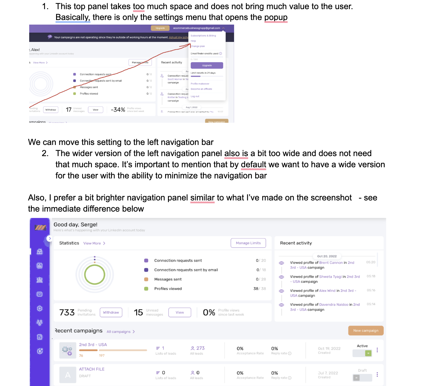
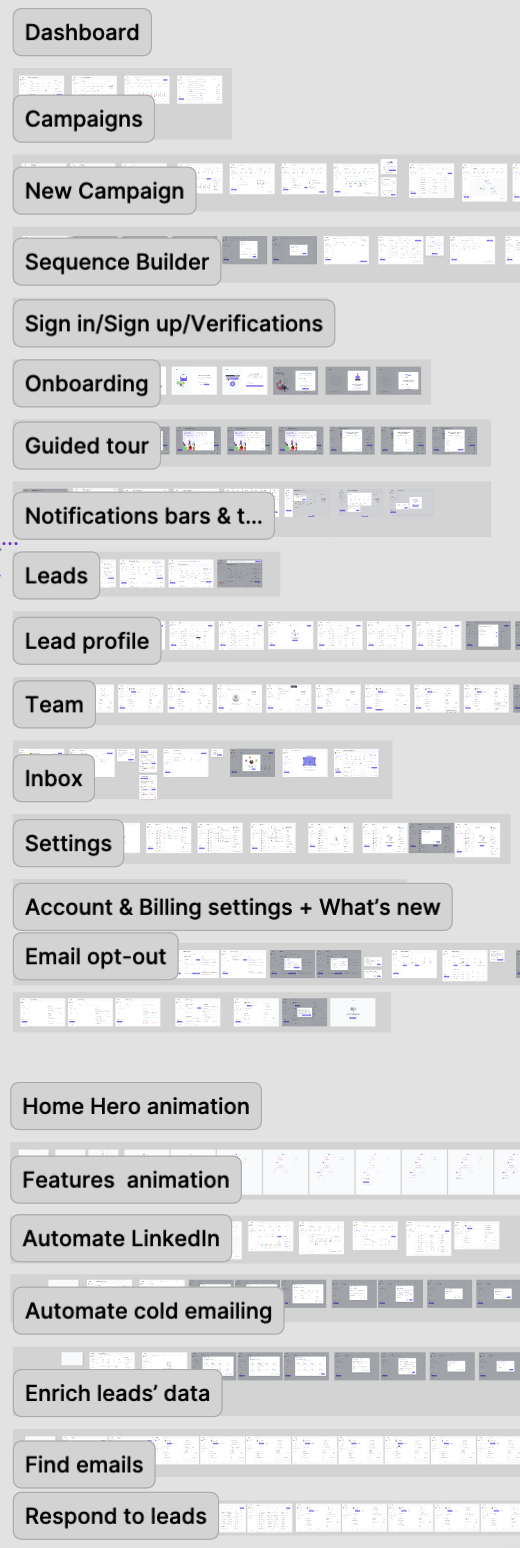
So, we systematized this information into concrete hypotheses and focused on UX/UI. The starting point in the design work was building a new design system and mapping functionality into user journeys.
Design System
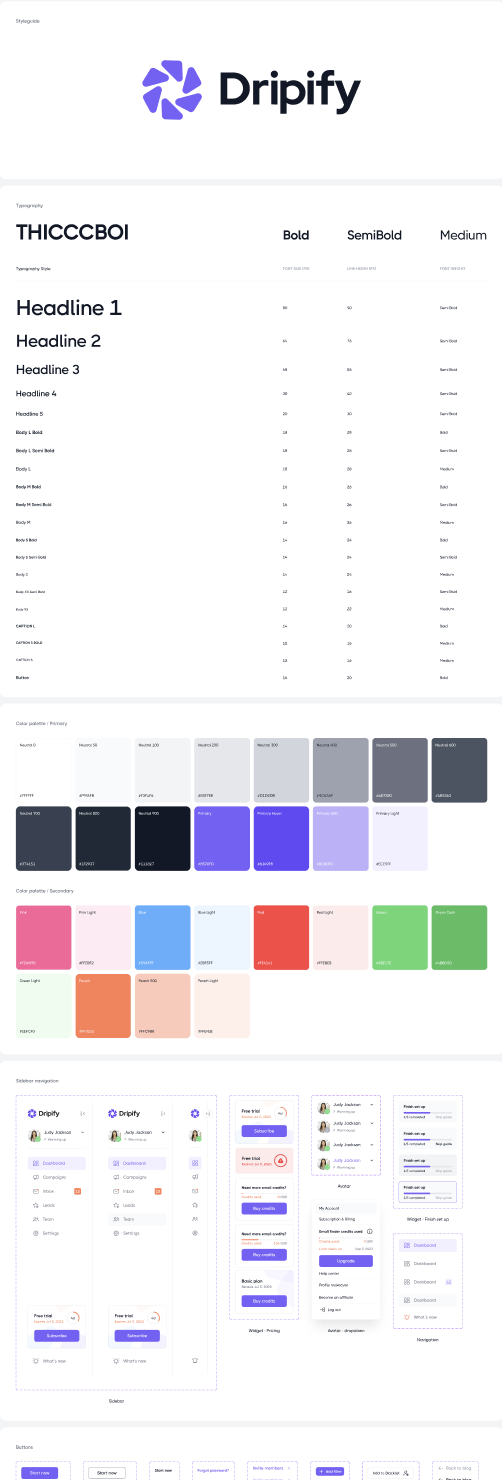
Based on the brand book, we built a new design system that extended the visual language of the website while accounting for all the nuances of future scaling.
The design system was rooted in the new branding and UI best practices, built from the ground up by our lead UX designer, Volodymyr Umatov.
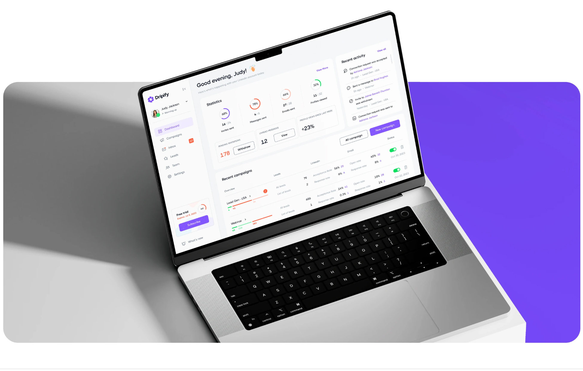
The product is the next step in the sales funnel after the website, so visually it continues the site — like one part of the journey flowing into the next. The product was developed thoroughly and with significant investment, so the Webflow-built website had to match the experience of the headless web app itself.
Now, everything feels like a single user journey.
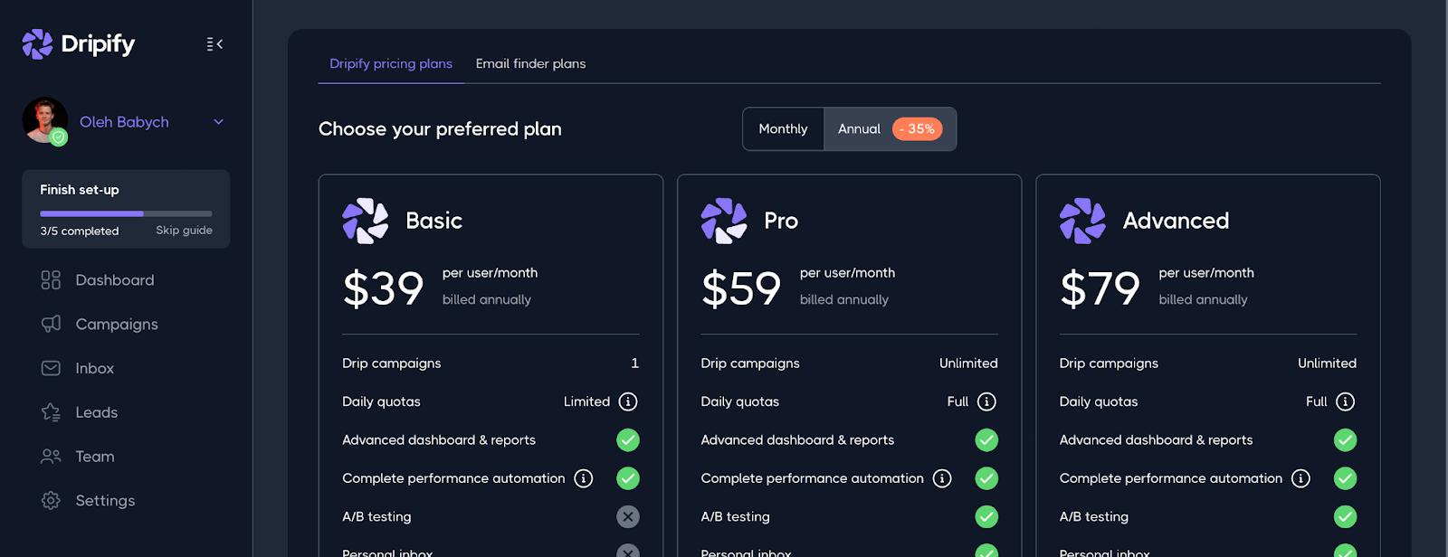
Once the user journey and system were approved, we began the detailed work of designing every screen and state, iterating constantly and staying in close communication with the client, their front- and back-end engineers, marketers, and CEO.
Product Expansion
An additional task for our team was to integrate new functionality. This is always challenging. Unfortunately, many designers and developers don’t think about potential product scaling, which later creates difficulties. That’s why good designers always think ahead about scalability.
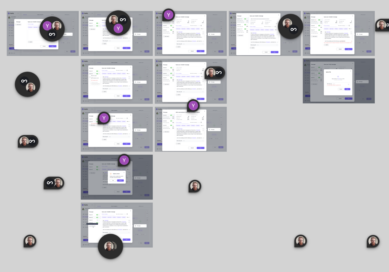
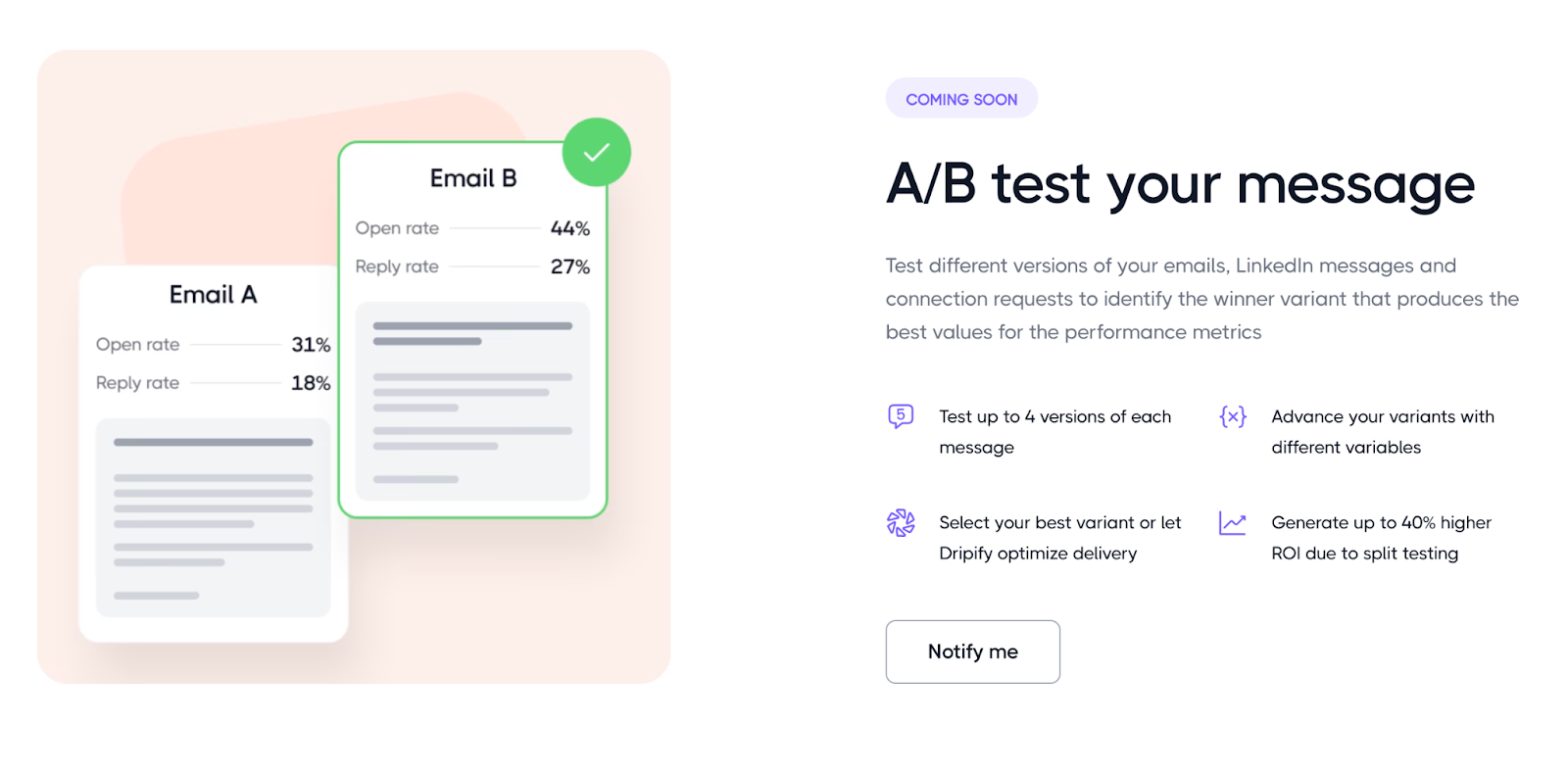
For example, to add full A/B testing for campaigns, intended as a new standalone feature, we had to update about 50% of the product’s screens, sometimes redrawing them from scratch because the supporting functionality didn’t fit into the existing design.
You should always leave UX space for maneuver in case of future expansion, and create a features list or prioritization map that accounts for both MVP features and potential ones.
It was also important that front- and back-end development ran in parallel to save time. Our PM, Dmitriy Riabovol, coordinated communication with all decision-making departments to keep deadlines on track.
Release
After six months of intense and inspiring work, the big release took place: Dripify launched its updated brand, website, and application. Everything felt like a single ecosystem, from the first visit to the site to deep interaction with the product.
You can see the visual case study with functionality on Behance: https://www.behance.net/gallery/223367325/Dripify-Branding-and-UXUI-Design-for-sales-platform
Or visit Dripify itself: https://dripify.com/
7. Results
The Dripify redesign was not about one isolated improvement. The result came from a series of connected decisions across positioning, branding, website UX, and the product itself.
The key changes included:
- marketing decisions based on research and testing
- branding aligned with the product’s positioning
- a scalable design system
- a website that clearly explains the platform’s functionality and use cases
- a more consistent journey from the website into the product
- a web application designed around real user workflows and future expansion
Together, these changes helped Dripify communicate its value more clearly and compete more effectively in an already crowded market.
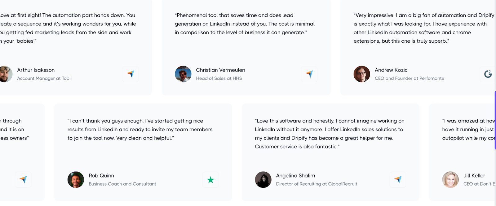
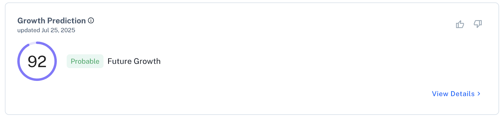
The strongest evidence comes from users themselves. Dripify has received strong ratings and positive feedback across independent platforms, particularly for usability, automation capabilities, and the overall product experience.
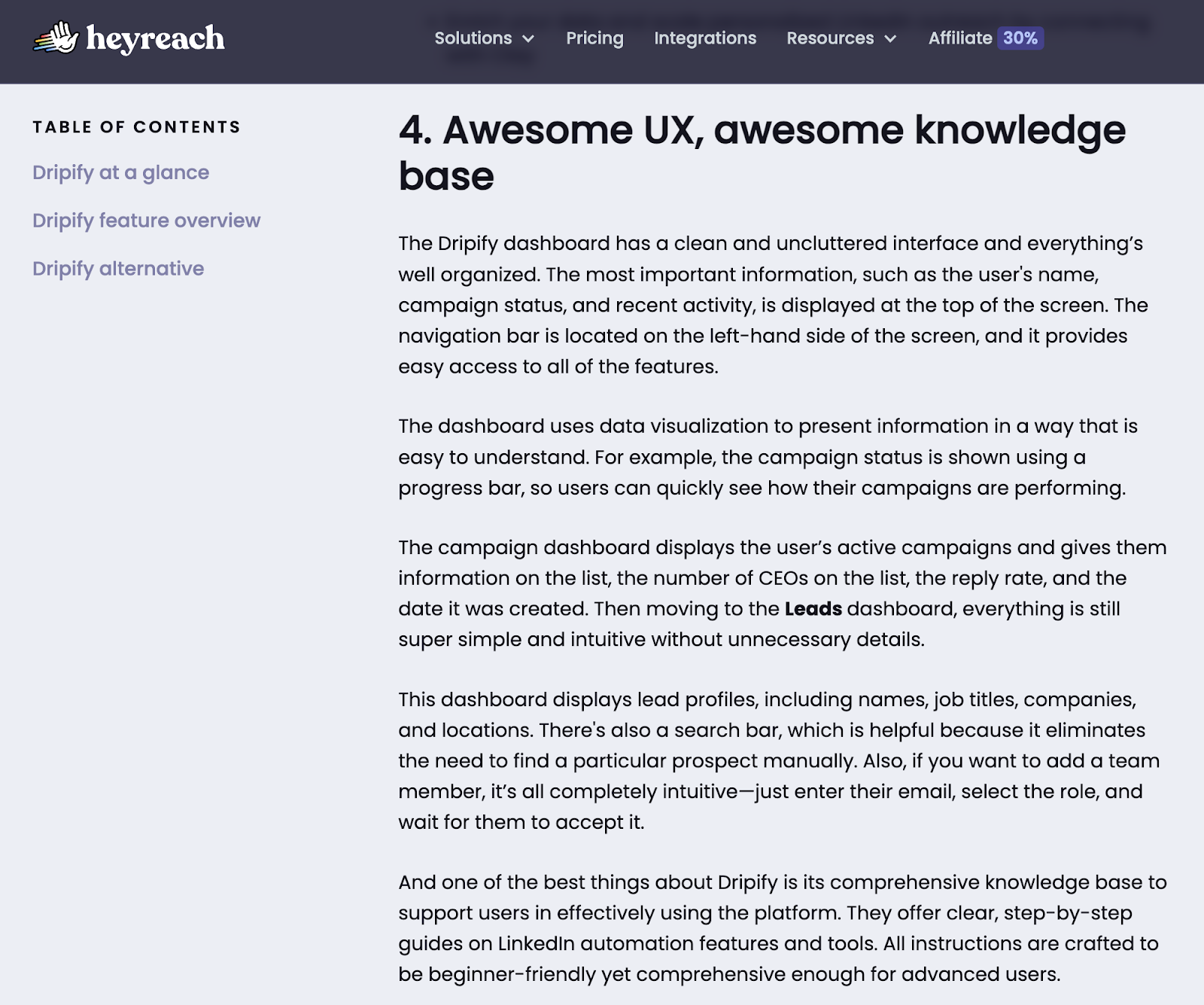
Positive evaluation from independent, algorithm-driven Crunchbase:

Naturally, a genuinely well-designed and well-thought-out product also received excellent ratings from users.
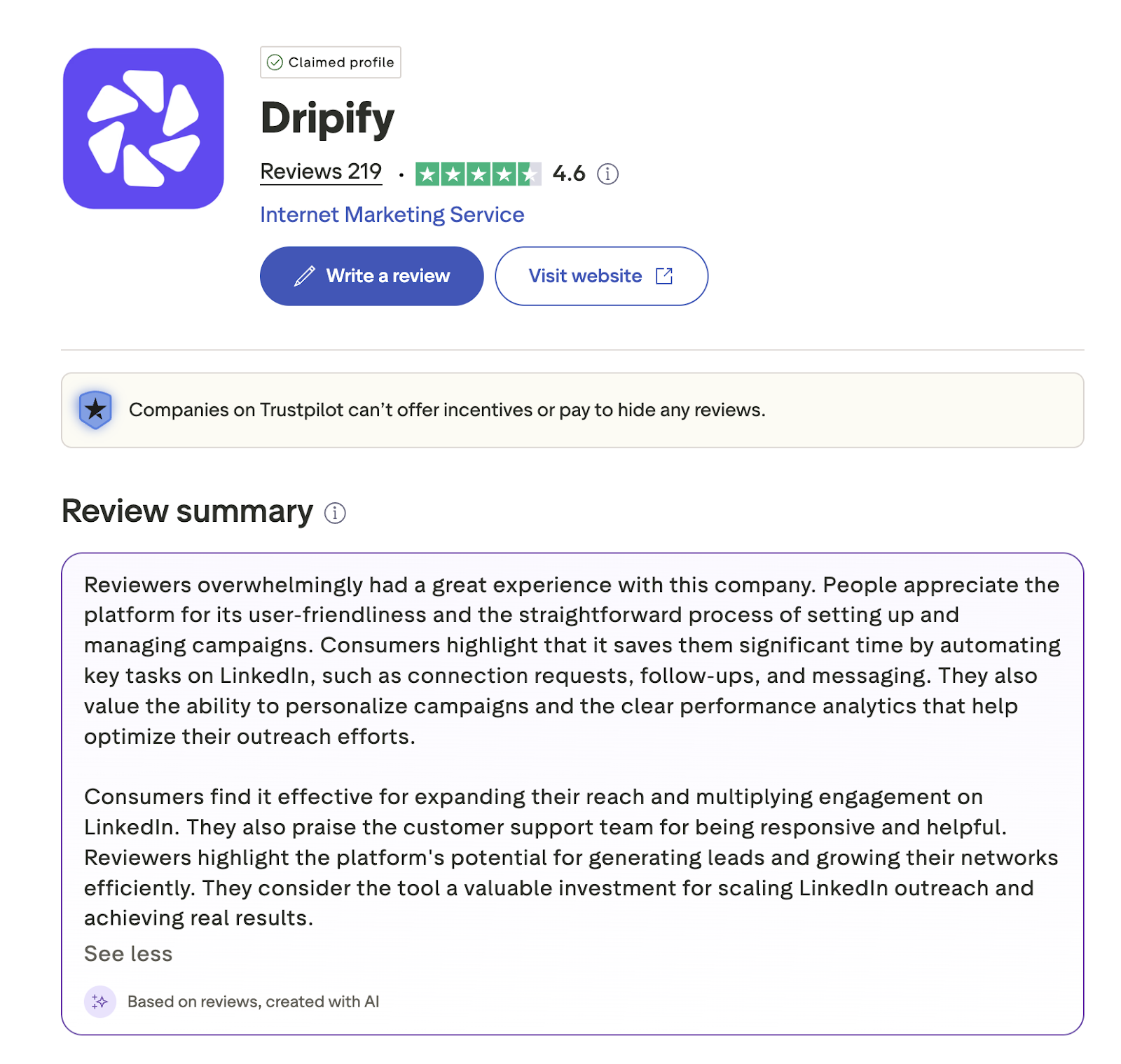
This is especially meaningful in a category where users already have plenty of established alternatives. Dripify did not need to dominate the entire market to succeed. It needed to understand its audience, make its advantage clear, and build an experience that supported that promise.
The founder of Dripify put enormous care into the product and wanted users to value it just as much. The results suggest that effort paid off, and we’re proud to have contributed to that transformation.
Big thanks to Oleg Babych for his valuable input on this case study.