Design for the Invisible: How to Make Digital Products Feel Real
Designers know how to make a physical product look real. But even experienced ones can get stuck trying to design an invisible product or tool. Think of a website for innovative services, an analytics or finance platform, a CRM system, and other tools like that.
If the designer can’t clearly imagine how the product works, how will the user ever see it?
This isn’t a sermon about researching a product until smoke comes out of your ears. I just want to share a few ways to make the invisible feel visible and tangible for the user.
Maybe my experience and our team’s will make someone’s life a little easier.
This difference matters. Understanding it helps you choose the right UX approach.
- Invisible product
An invisible product is a tool whose work doesn’t appear in the physical world. You can’t show it through familiar images.
You can easily picture a child building with blocks or a parent making toast. But now, life gives us different kinds of “toys”:
- CRM system
- Analytics platform
- API integrator
- Backend tool
- SaaS solution with little or no visual interface
User perception: “I can’t see how it works, but I want to see clear results.”
When people use an invisible tool, they are mentally outside of the process.
(Picture someone withdrawing cash from an ATM — something like that.)
- Virtual product
This one is also intangible, but it gives a sense of being part of something. It’s more like a digital version of a real process. For example:
- Online course
- Subscription service
- Personal AI assistant
- Avatar, skin, NFT
User perception: “I can’t touch it, but I’m part of it!”
When people use a virtual tool, they are mentally inside the process.
(You’re not walking to an ATM; your digital twin just made the transaction through an app.)
- Common mistake
If you ask what a user sees first when opening a site with invisible services or tools, most will say the design.
Of course, they’ll see the design, even if it’s hard to call it that.
But what they really need to see is the possibility of getting what they came for. Design can either help them feel it or push them away.
Let’s look at what helps users quickly understand whether they’ll find what they need, and how to make an invisible goal visible.
Let’s be honest, it’s not easy to design a fundraising process that makes an entrepreneur jump out of their chair shouting, “That’s it! That’s exactly what I need! I love you guys!” Or to design a startup site that makes investors shake their wallets and fight for the right to pour in a million or two.
But it’s not as impossible as it sounds.

You just need to understand that the “Wow, it’s beautiful!” emotion works great for Instagram, but not for clients like ours (or our clients’ clients). They’re not impulsive buyers. Their emotions are mostly mental ones. They think like professionals. The first thing they ask when looking at a website is: Can I trust this? Is what I need here? They’ll say “Wow” — but only after they’ve analyzed what they see.
That’s where the effect of first impression helps us out. It’s universal and works for everything. Even the most skeptical analyst won’t stay indifferent if their first thought is, “Looks professional.”
A good first impression and a sense of trust come from:
• visually consistent, harmonious design in a single style;
• minimalism: clarity, contrast, whitespace, calm, and readable typography;
• order and logic in every section: clear visual hierarchy and the right accents;
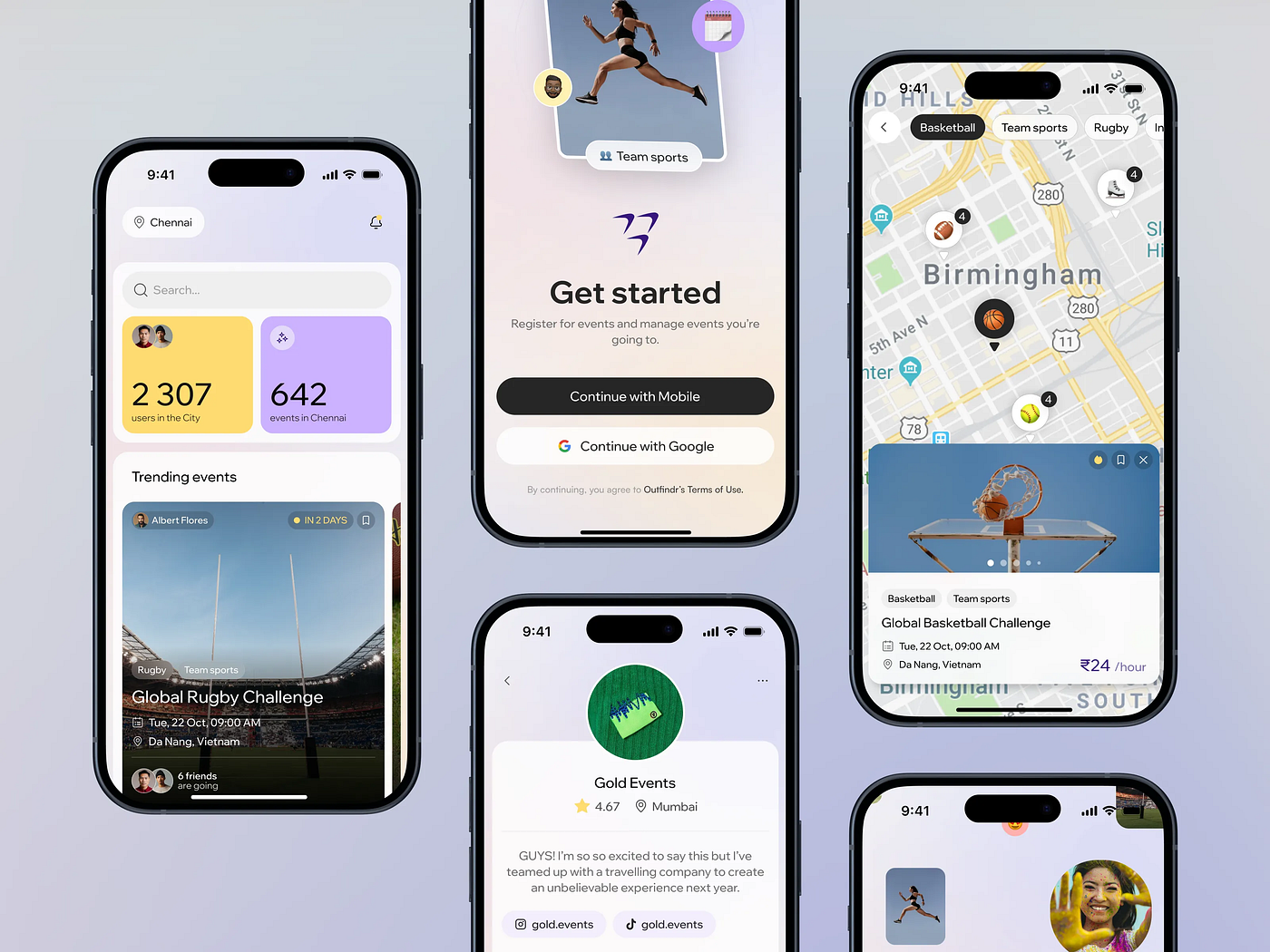
• predictable and simple navigation;
• a clear statement of purpose (a short description of what the user aims to achieve);
• a concise explanation of benefits and value;
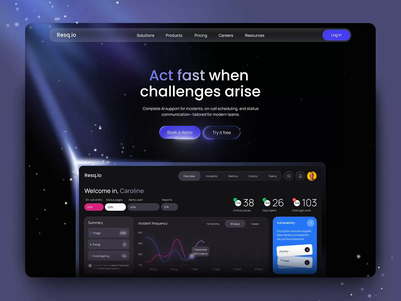
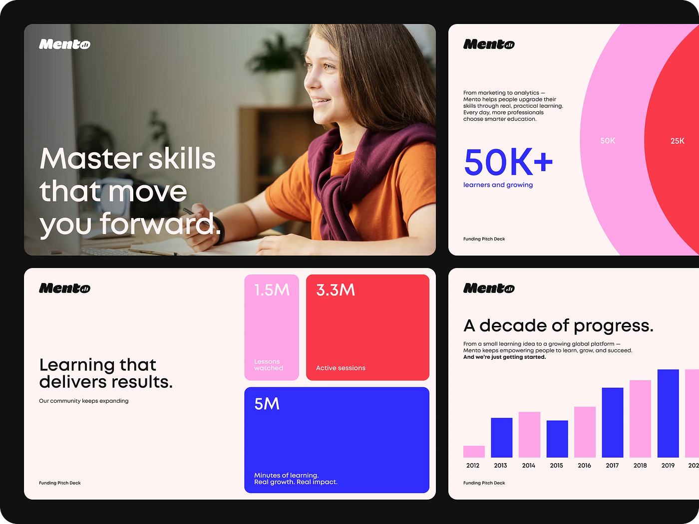
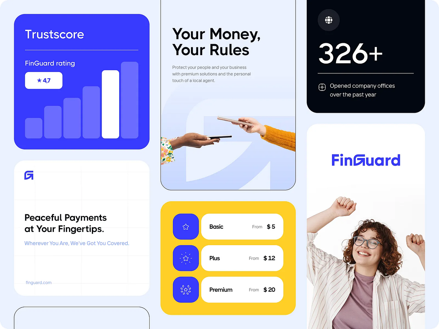
• visible proof of success: infographics, testimonials, case studies with real results.
In the end, it simply means quality design. For invisible products and services, that’s crucial.
We all know the basics of a good user experience:
• convenience and intuitiveness (the user quickly understands how to use the product);
• efficiency (goals are achieved fast and without friction);
• usefulness (the product solves real problems and often exceeds expectations);
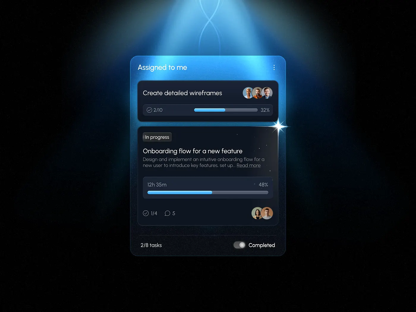
• emotional response (interaction with the product feels good and makes people want to return);
• micro-interactions that confirm each successful step;
• accessibility for different groups of users;
• a desire to repeat the experience.
But in the world of invisibles, that’s not enough.
Super-Еxperience
Invisible tools need more than just good UX. A super-experience engages the senses, and yes, it works great with digital products. In fact, that’s where the future is heading.
Our senses: sight, hearing, smell, touch, balance and motion, and finally, intuition.
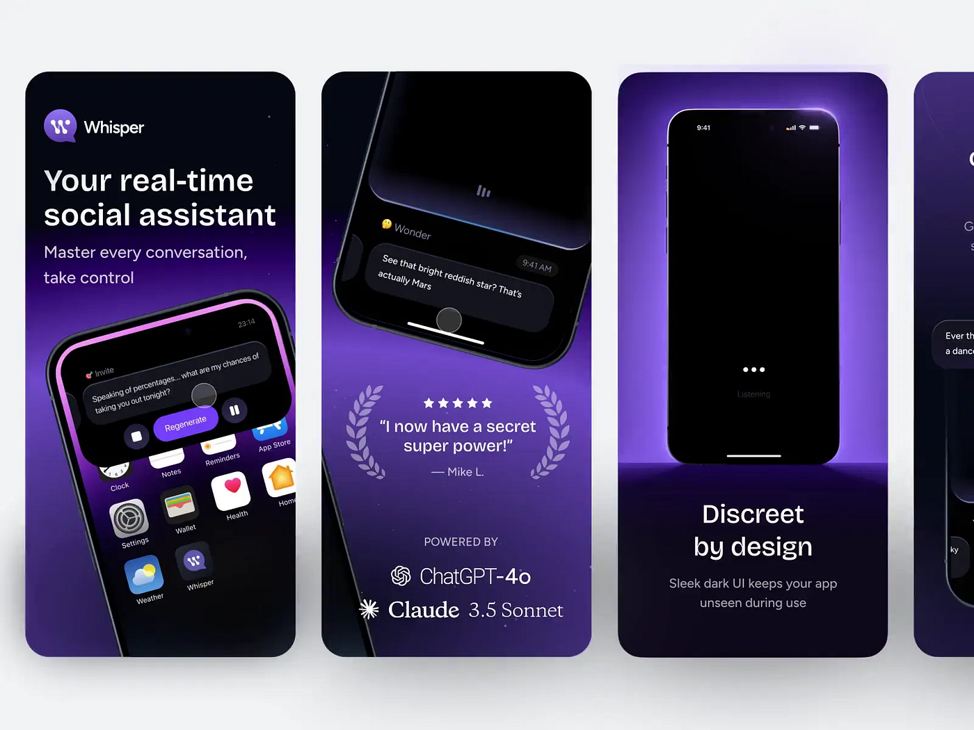
Sight. That one’s obvious — we look at the design. Sometimes it’s not just what we see, but also, for instance, a photo of a person whose gaze leads us toward what matters.
Hearing. Interface sounds confirm what the user does (clicks, taps, messages, sometimes even music). But every sound needs testing. Don’t overload the brain, and always give users the option to turn it off.
Touch. You can’t feel a real button, but you can simulate its feedback or surface texture. For the brain, that’s a sensory experience. The more natural the gestures (tap, swipe, press), the deeper and more pleasant the interaction feels.
Balance and motion. These are not only about physical space. People perceive visuals as balanced or unbalanced, dynamic or static. The layout can make them feel movement or stability.
Smell and taste. Here we rely on memory and associations. A photo of a steaming cup of coffee can make us almost smell and taste it. We often describe design as “fresh” or “tasty”, and good style as “having taste” not by accident.
Intuition. A well-designed interface helps the user know where to go and what to do next.
UX makes things easy. Super-UX makes them feel real.
The more complex and invisible the processes your digital tool handles, the more important it is to give it something human.
We can’t draw a face for our interface, at least not yet. But we can create the feeling that the user is talking to a living, responsive companion.
People like to be guided, encouraged, and helped in their efforts to make life better. Focus on teaching and support rather than on selling or self-promotion. At every stage of the journey, the product’s inner guide should feel human and caring, even if what the user sees in the end is data, infographics, or statistics.
It’s not about what you offer, it’s about the way you do it.
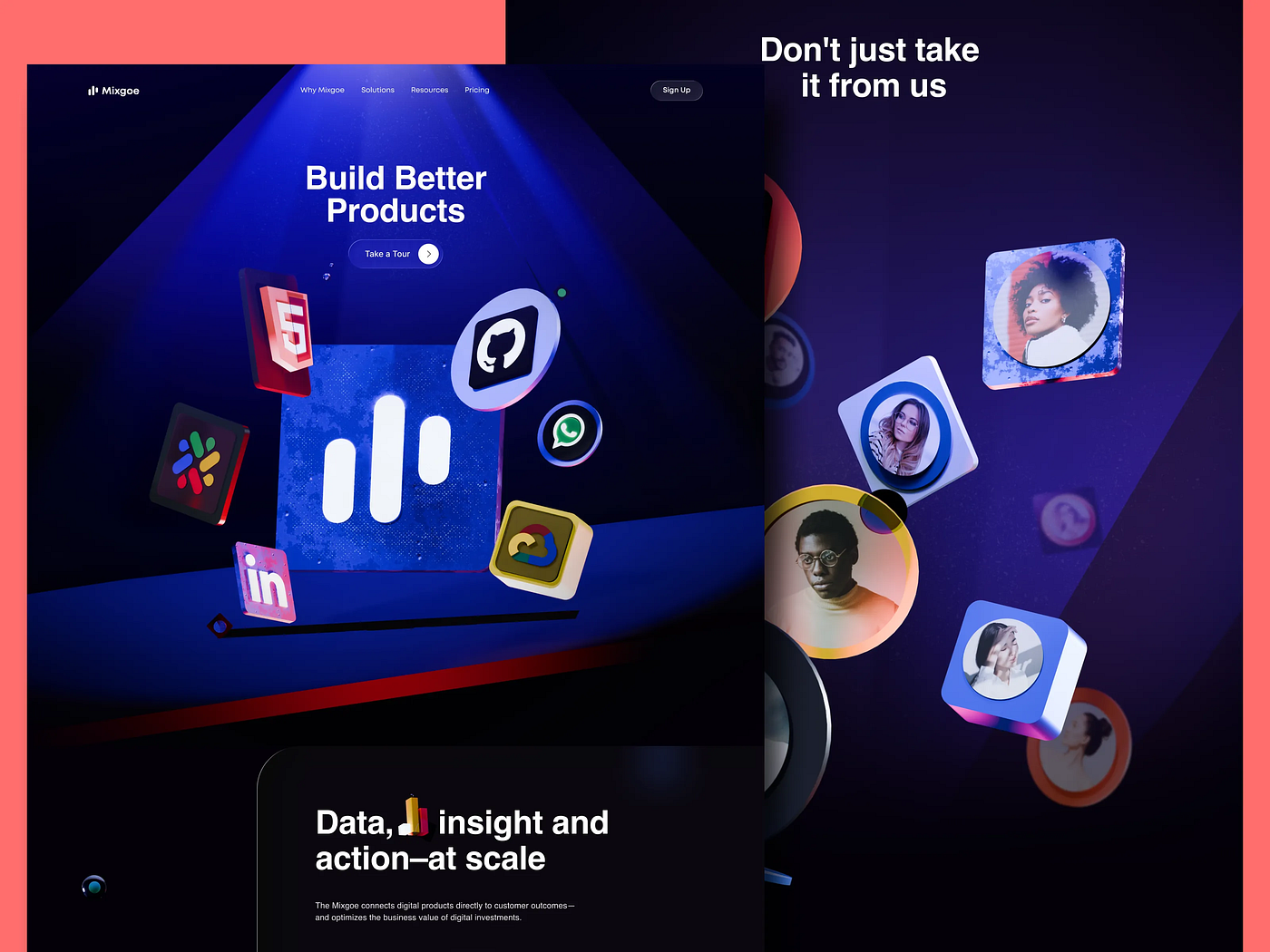
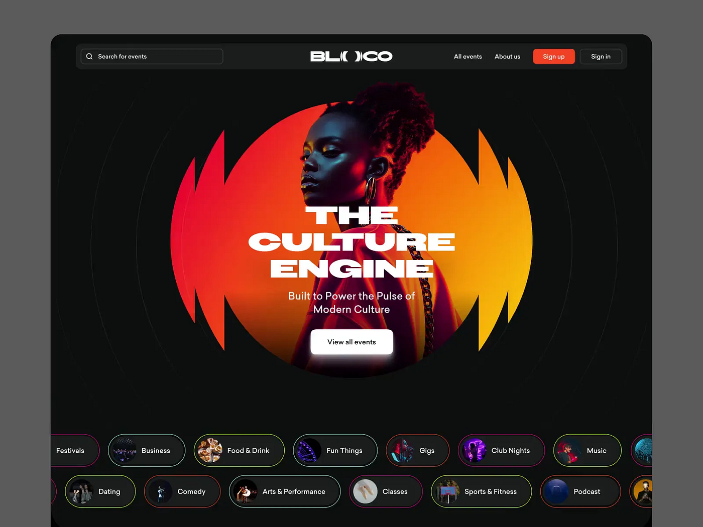
Tool-based products rarely use images of people, but that doesn’t mean it’s forbidden. Human faces can appear in the hero section if it fits the concept and the visual style. It’s good to show the faces of team members, their stories, and their experience. Users like to feel that behind the screen there are real people ready to answer questions and help when needed.
Our team has often used illustrations for complex, technical products, and it works very well. It not only makes the product more human but also easier to understand. Sometimes a mascot helps too, giving the product a face and personality. But again, these things should always fit the concept and be tested.
Humanizing a product should start at the idea stage. Doing it later costs time, money, and nerves.
We can’t see or touch intangible products. But we can make the experience of using them feel real. And that means we can materialize them.
To the brain, pressing a real button and clicking a digital one feel almost the same. The more senses are engaged in the design, the more realistic and pleasant the experience becomes, and the stronger the memory of it stays. That’s what Super-UX really is.
An invisible goal becomes tangible when design shows the path to it, motivates people to keep going, and supports them along the way.
It’s in our hands to turn abstraction into experience, numbers into confidence, and interfaces into friends and helpers. When users feel connection and living presence behind the screen, the invisible product comes to life.
Products that become visible in our minds always inspire more trust and affection. And the work invested in them always pays off.