Dashboard Design: Useful Tips

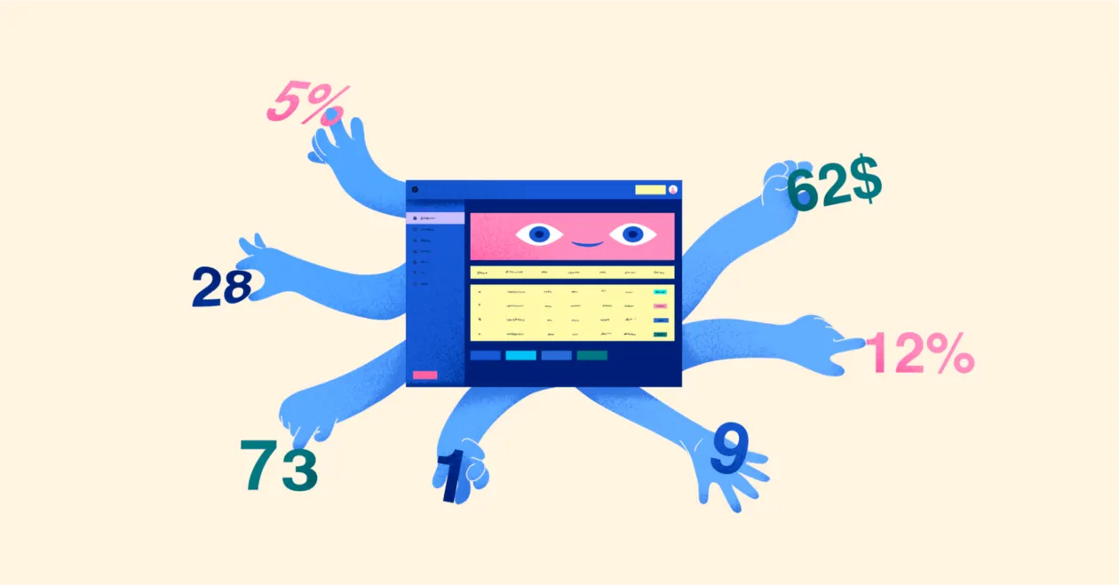
A cool-looking dashboard may have plenty of functions, good widgets, and visual flourishes. But in reality, it’s often just a shiny toy rather than a useful tool. Something akin to a many-armed robot that shuffles data, sorts them into neat piles and dazzles you with bright readouts. Like a magician doing a card trick, it looks impressive, but its brain is only as good as its sleight of hand.
Playing with this dashboard robot can be fun, but it ultimately leaves the customer disappointed. It doesn’t live up to the expectations.
Why does it happen? What’s the trick to creating a tool rather than a toy to be quickly discarded?
1. Conceiving the dashboard: the brain
Let’s delve into design anatomy.
A dashboard’s parents are the customer, the designer, and the developer. Each one contributes something through their cooperation. All the essentials are introduced at the very beginning (or they aren’t).
A sapient human develops from an embryo. Brain cells and nerve cells are the first to form, followed by the rest of the body’s cells. And that’s exactly how any viable project should be created.
The first stage is the most important. If you miss something here, no fancy design will save the day. You are laying down the foundations for your dashboard’s long-term development.
“Why was I born? Who needs me?” a dashboard would have asked if it could.
Can you answer that? Because you need to decide:
- How will the dashboard advance the company’s goals?
- What structure, functions, and visuals will allow the dashboard to perform its tasks?
- Which design is optimal for your target audience?
The answers to these questions will form the very basis of your design concept. (Now you can tell your dashboard the meaning of its life.)
A dashboard’s “intelligence” is its ability to fulfill its purpose.
Some people think that only an analytical dashboard needs intelligence, whereas an operational one only requires readability. They are wrong. Let’s say you have an operational dashboard for motivating employees. The user’s attention should be geared to comparing the results and highlighting the leader. But the designer made the numbers more visually prominent than the leaderboard. A tiny little thing, isn’t it? Yet it’s enough to make the dashboard fail in its purpose.
There are no trivial details in a dashboard.
The information presented by a dashboard should enable the user make a decision. The designer’s job is to help them, not to make them solve a puzzle with an array of cool widgets. Anything that doesn’t work toward the goal works against it.
From the initial to the final stages of the project, the designer must keep sight of the company’s goals, the dashboard’s goals, and the users’ goals.
Otherwise the dashboard will never progress.
2. Data & KPI selection: the circulatory system
The dashboard data are like circulating blood. We must understand where they come from, how they are processed when the user might need them, and how they should be visualized.
The designer needs to understand the purpose of metrics. Obviously, this will help them choose the proper widgets, but there is more to it. For example, a customer wants to see lots of various readouts on the screen. It’s not up to you to remove anything to clear some space, but what you can do is highlight the most important things and visually “tone down” the secondary stuff. To be able to do that, however, you have to know which is which.
The most important metrics work toward the goal and help to control the process (or product). For example:
- they display the actual success rate;
- they affect how the product is perceived;
- they motivate the team that creates the product.
The choice of metrics also requires an understanding of the audience. Which KPI should the users see and what visual presentation will they find the most understandable?
People like seeing numbers correspond to their goals.
3. Dashboard structure: the skeleton
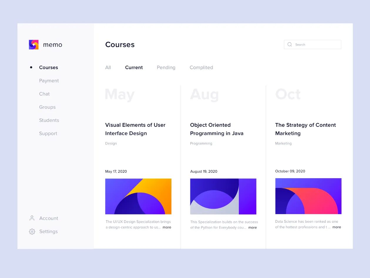
Imagine entering a hotel room and seeing a bed, a table and chairs, a mirror, and a closet. Without even opening the closet you can guess what’s in it. The hairdryer, slippers, and towels are where you expect them to be — someone has made sure of that. A good dashboard resembles that room. It’s clean, it’s neat, it’s predictable. You see all the essentials right away and you intuitively know where to find the rest.
Designers have their own tools for ensuring neatness.
- hierarchy
First of all, you have to put your mind in order. Before getting creative, be sure to order all the data, break it down into categories, understand what comes first, what comes last, what follows what, and so on. Identify the key things that the user must see right away.
The visual hierarchy must reflect the information hierarchy.
Data hierarchy is expressed through the size and location of the widgets. If your audience reads left to right, the key info must go into the top left corner. The least relevant info will be in the bottom right.
The method of ordering data will depend on your dashboard’s purpose. The important thing is to structure the information according to its priority and create logical scenarios.
Think of the information panel as a story, not as a sequence of data points.
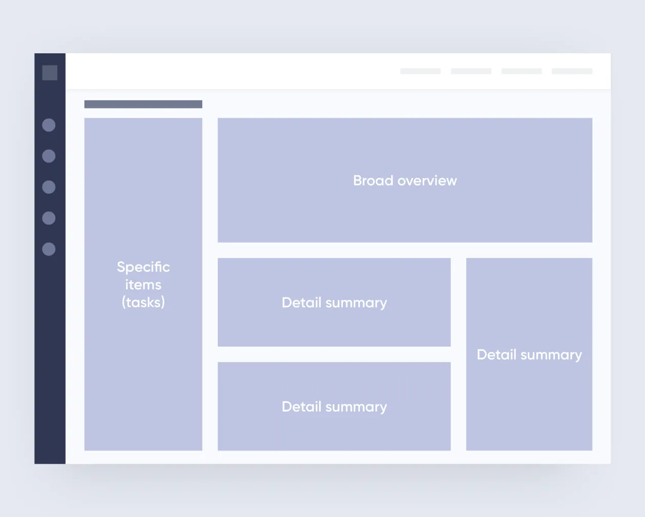
- grids
Grids are great for creating the general layout of the page, ordering, coordinating, and aligning elements.

- information modules
The system of modules is similar to zoning in an apartment. The bedroom is for sleeping, the dining room is for eating — each zone has its function. Your comfort depends on how conveniently they are located. A bad layout cannot be fixed with renovations or furnishings. Similarly, modules have to be considered in advance.
Modules help you display the content hierarchy, group data according to their significance, correlation, and logical connections. Each module should serve a specific purpose within a given process.
- continuity and proximity
If your way to the kitchen requires passing through a hallway with two doors, that’s a bad layout. Interconnected processes assume logical proximity. If a process in one block requires information from another, the layout should provide continuity of data. This must be considered in advance so that users won’t have to dig through obscure storage rooms to get at the information they need.

All related information should be grouped and located in close proximity, from most important to least important.
- separating modules
No one needs a kitchen that segues into the bedroom. To separate one block from another you need “air,” or negative space. Make sure to consider it at the outset: think of negative space as a combination of design elements that need visual balance.
4. Functions: the muscles
The number of functions and tools is determined by the purpose of the dashboard and the key goals of its users.
To move about freely, a human needs only two legs, a dog needs four, and a spider needs eight. A dashboard with too many functions is as good as a six-legged dog. Which is a bit creepy.
Do not overload the control panel with a multitude of tools. The user only needs to have the necessary things close at hand. An excess of available tools makes people confused and scares them away because it looks too complicated. Personalization is always better than customization.
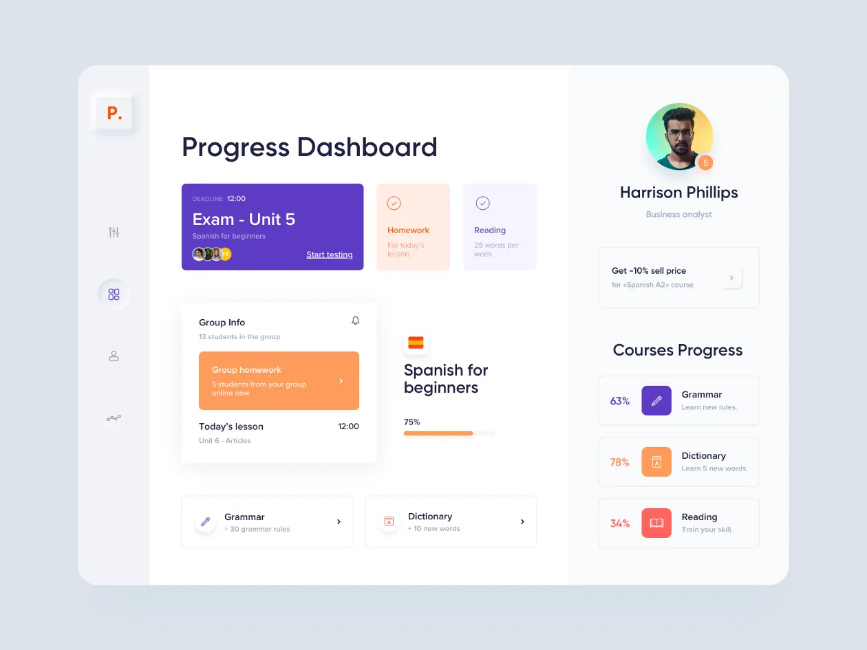
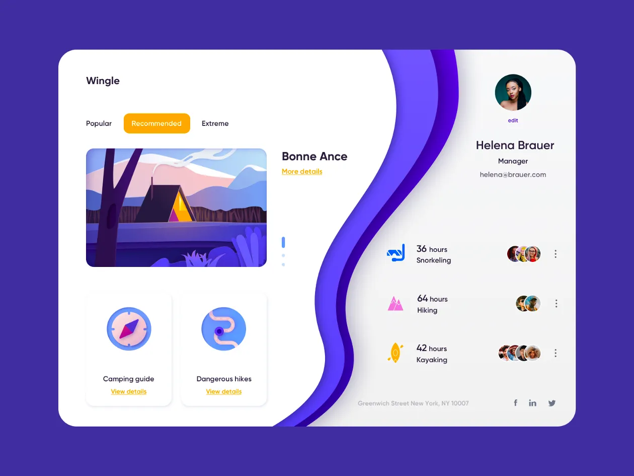
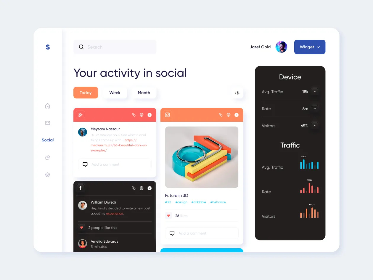
5. Widgets: the vital organs
People have trouble comprehending the content if there are more than 5 to 7 widgets on the screen. So our job is to make the relevant data accessible but not excessive. The user should comprehend what they are seeing in a matter of seconds.
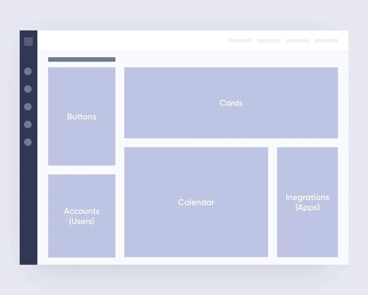
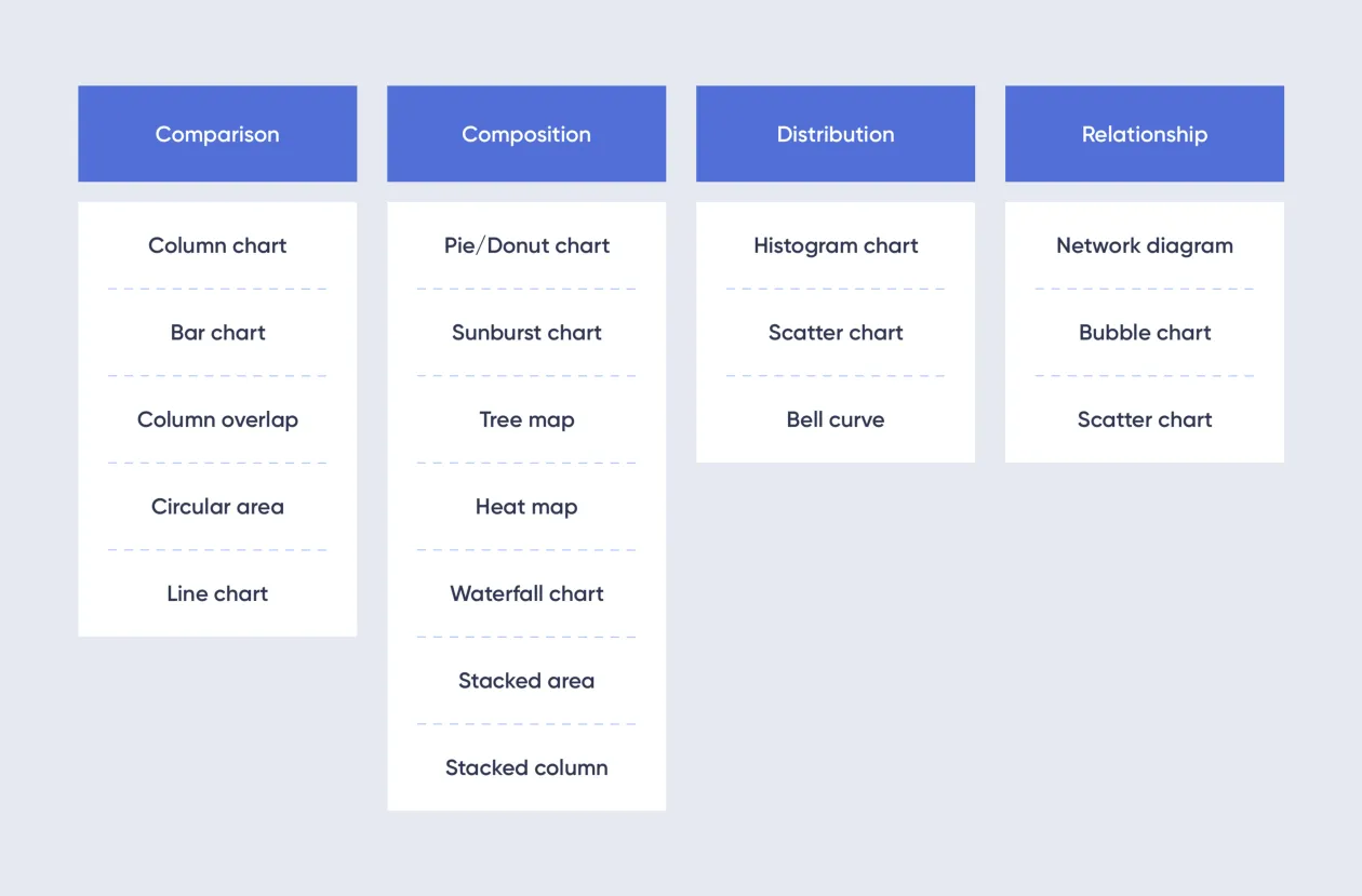
Data visualization tools include:
- tables
- graphs
- diagrams
- cards
- indicators
- maps
- images
- groups
- filters
- lists
- selection trees
The choice of widgets depends on the purpose of the dashboard and on your audience. Think about the following:
- Which widget best displays a specific KPI?
- What should the users be able to see right away?
- Which widget will be the most comprehensible to the users?
- What will help the users to find what they need faster?
Choose the widgets that are easily understandable and readable.
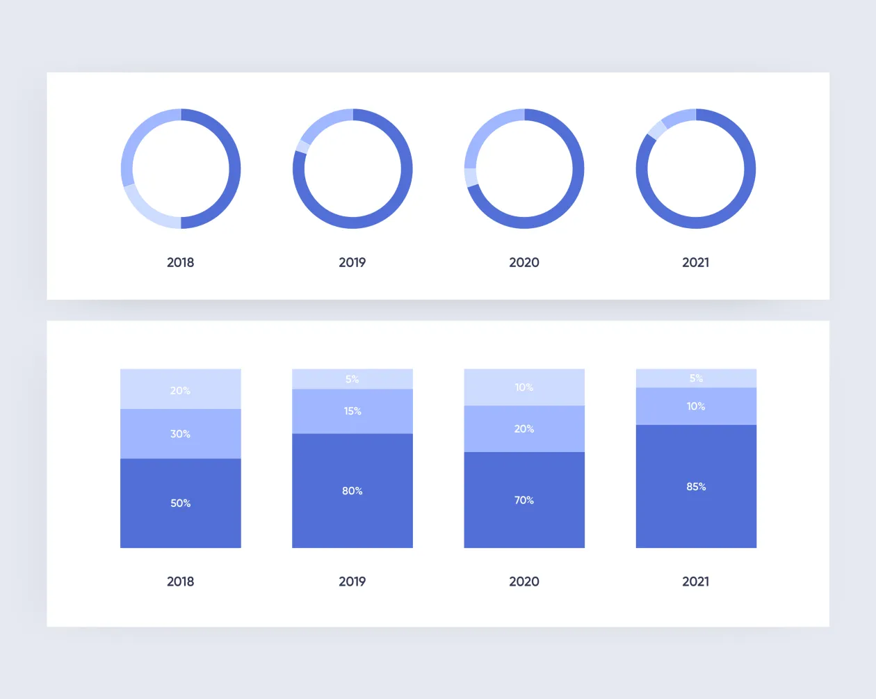
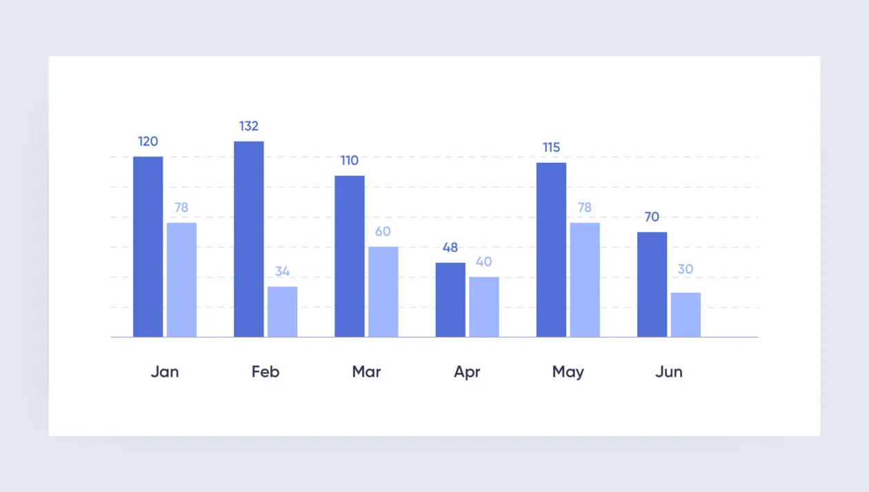
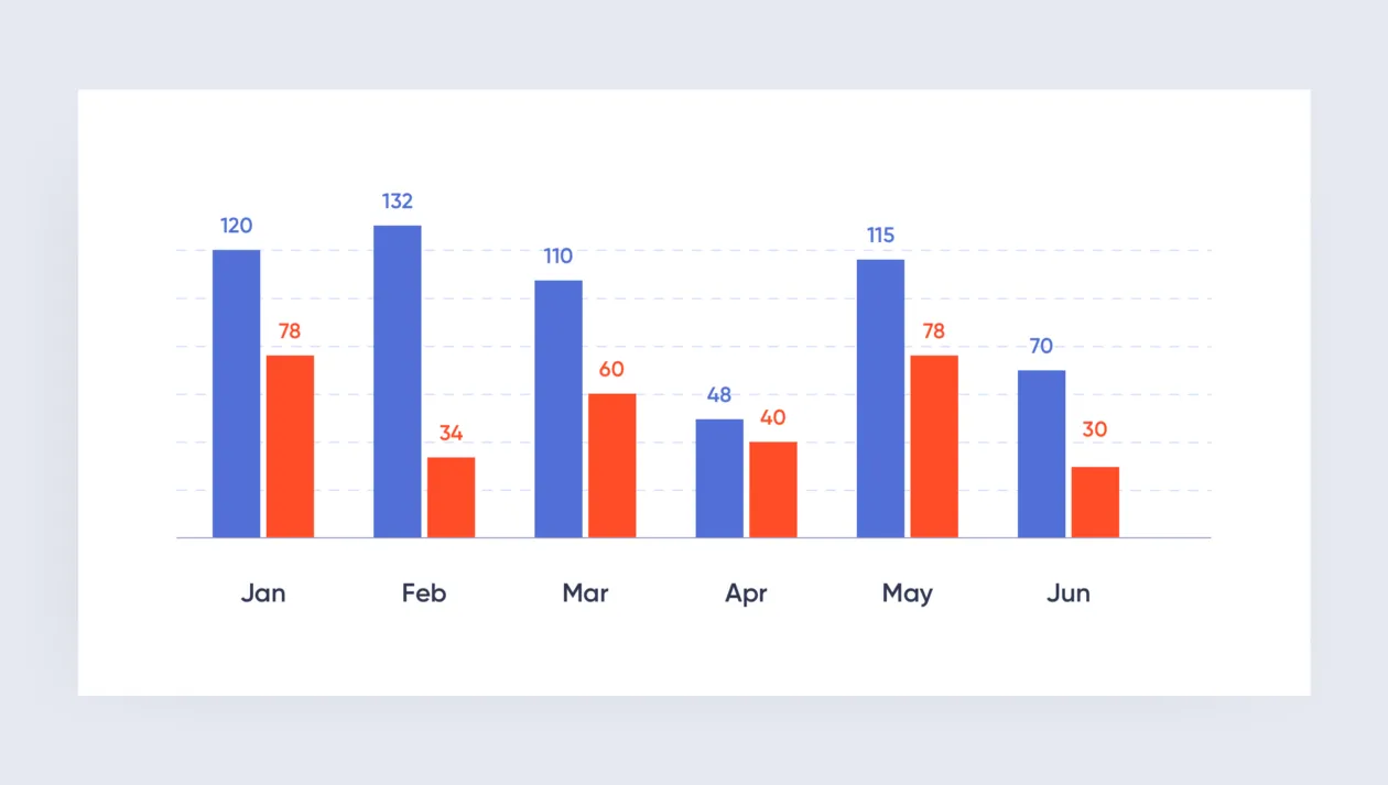
Here’s an example of a confusing widget as opposed to a more comprehensible one:
Think of the main “targets” to focus the user’s attention. For example, if your priority is performance targets, you should use figures; if you need to compare values, a line or column chart will work well; to motivate the team, use a leaderboard with relevant highlights.
An improperly chosen widget or a default widget template may confuse users or cause them to misinterpret the data.
The best solutions are always a result of analysis and testing.
The best widget design is minimalistic and easily readable. A 3D diagram, for instance, may look impressive, but it takes up too much of the user’s attention and ultimately proves a distraction. This also applies to gradients, excessive use of color, and too much detail.
6. Visual design: general tips
We have created the mind and body of the dashboard. The only thing that’s left to do is the skin — the outer layer. This can be done according to the basic principles of good old design, but there are still some specifics.
- simplicity
A dashboard should be as clean as a desk that you enjoy working at: it must only have the necessary documents and tools, with no distractions.
- color palette
The choice of color for a dashboard must serve one purpose: to present information as clearly as possible. The bigger your color palette, the harder it is to accomplish. So don’t overload the dashboard with colors. It’s always preferable to use shades or different hues of the same color.
First, you need to choose the base color, then the complementary colors. Each color must serve a specific purpose. One color may be used to combine and group elements, another can be used for highlighting. Colors also show whether an element is active or passive.
Avoid using colors that can have negative connotations. For example, in this instance red looks like it represents something bad and undesirable:
If the dashboard offers customizable colors, make sure all the available choices look good.
A good tool for selecting color combinations is Adobe Color CC.
- highlights
Semantic highlights should correspond to visual highlights. To highlight an element, you can use color (contrast, brightness), shape, size, negative space, etc.
- readability and numeric formats
This is everything that ensures visual clarity: clean layout, visual hierarchy, highlights on essentials, contrasting elements, proper fonts, which must also be contrasting and legible.
High-precision numeric formats are difficult to comprehend. It’s a good idea to round up any numbers you can and trim down longer ones.
7. Adaptability
In practice, creating a web version before the mobile one is justified when the desktop version is a priority for users. If your target audience will mostly use the mobile version, start building your dashboard with an eye to mobile devices first, then do the desktop version.
In conclusion
Designing a good dashboard is no easy task. We have likened it to human development because it’s a good way to remember the important stuff and show the successive stages of work. When you are developing a dashboard, keep asking yourself: is everything in place to make it work? Are there any extra limbs? Do all body parts work well in concert? Will the users like the result? Will it be useful?
As you can see, visual design is actually the last thing a designer should worry about.
If you haven’t missed anything, your dashboard will be a valuable helper to your users and not just a toy.