Branding 2026: fundamental changes
Most “next year trend” lists recycle last season’s ideas and give them a fresh coat of paint. So I gathered only what will actually change, what we’ll deal with tomorrow.
These aren’t hypothetical trends. These are real changes that are already shaping approaches in design and communication.
They will define branding for the coming years.
If you work with brands today, these are the shifts you’ll actually feel in your day-to-day decisions.
1. AI integration into branding
Whether we like it or not, mastering AI tools will become a significant competitive advantage. With them, a business can save resources, improve its products, raise the quality of communication, and ultimately leave slow-moving, conservative brands far behind.
AI helps to:
- create and adapt content for different platforms;
- analyze user data and forecast behavior;
- personalize the experience;
- interpret feedback and build recommendation systems;
- generate ideas for strategies;
- boost the effectiveness of marketing campaigns;
- respond faster to changes in audience behavior;
- optimize search and improve brand visibility online.
AI is also a set of technologies that work together and amplify each other:
- machine learning and behavior prediction;
- natural language processing and understanding of feedback and context;
- computer vision and analysis of visual content;
- generative models for creating text, images, and scenarios;
- behavioral analytics and interpreting weak user signals;
- multimodal AI working with text, images, and video at once.
This ecosystem helps brands see more and act faster.
For your brand, the real advantage comes from using AI not as a gimmick, but as the backbone of everyday decisions.
Ethical framework
Despite all the advantages, companies should use AI only with a clear understanding of their goals, and they must handle gathered information ethically. People don’t want to feel like fruit flies under a microscope. They also need to know that real people stand behind the brand, not a faceless machine.
So part of the automation has to be balanced with a sense of human involvement — through tone, visual decisions, responsive service.
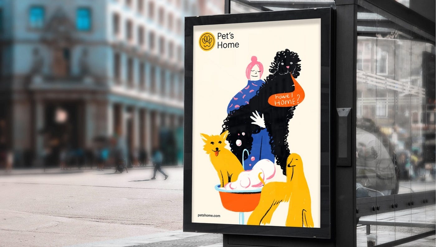
2. Anti‑AI aesthetics and the value of a human touch
The more brands use automation, the stronger the demand grows for visuals that feel alive.
People can spot AI work even when they can’t explain how. It’s the same instinct that helps us see the difference between a stock photo and a quick sketch made by a real person. So brands face a new task: bring back the sense of human involvement through visual language.
In the next few years, techniques that create a sense of “imperfect” reality will be in demand, and this has nothing to do with bad design.
Visual design techniques that give a brand a human feel:
- original illustrations, even in the style of children’s drawings;
- visual texture such as grain, roughness, or textured backgrounds instead of flat fills;
- micro‑imperfections, slight asymmetry or imbalance;
- layered compositions;
- mixing photos, text, and textures;
- subtle incompleteness as an expressive device.
These choices bring back the feeling: this was made by people, not by a machine. That builds trust and likability.
3. Attention economy
Audience attention has become a currency. And the cost of losing it is higher than ever.
People are sick of information overload. Their attention scatters, concentration drops. So products and content that can attract and hold attention will move ahead. You can’t achieve that with visuals that look like a competitor’s, super‑trendy visuals, template messages, or shallow campaigns.
Attracting attention with design is relatively easy. Holding it is the challenge. If your product lives online, this is where you’ll either keep people with you or lose them in a second.
Brands will need to rethink communication. The focus will shift from selling to building relationships and influence. This will naturally be reflected in visual design.

Minimum signals, maximum clarity
A brand must register instantly. If a person doesn’t immediately understand what’s being offered, they’ll leave the page faster than you can say the word brand.
Visually:
- clean, direct first impression;
- one main visual signal such as a color, shape, or typographic accent;
- no secondary noise.
Minimalism stops being a fashion statement or a design preference. It becomes a tool that reduces perception load and helps convey a brand idea faster.
Typography as a carrier of meaning
In 2026, text’s role strengthens. Typography becomes part of identity just like color or shape. It helps convey ideas quickly and keep attention — as long as it has character.
Working techniques:
- large, meaningful headlines;
- rhythm and modulation of text as part of visual language;
- a deliberate system of accents and spacing.
For text to work, a brand needs to speak its audience’s language.
Here are the visual tools that actually help people stay with you longer:
- microdynamics, liveliness without excessive animation;
- rhythmic typography;
- reactive graphics, elements that slightly respond to interaction or context;
visual compass markers, visual guides; - layered depth;
- tactile surfaces and textures;
- structural contrast such as smooth plus rough, matte plus grainy;
- breathing spaces that help the rhythm;
- mini‑stories in 2–3 frames;
- slight asymmetry in composition;
- micro‑differences that the eye notices.
Important: use these tools within the brand’s character, not just for effect.
4. Usefulness, functionality, care
Increasing life dynamism and people’s overload with problems call for the opposite from new‑generation brands. Namely: simplicity to relieve cognitive stress; prompt help to give relief; speed to save the user’s time; effectiveness to solve problems.

Overall, the demand will be for more of everything: more responsiveness, more reliability, more guarantees, more care.
A special emphasis on usefulness. A person must instantly understand that this brand is needed and useful.
Reflecting usefulness and functionality in visuals:
- clear text and meaningful message;
- clean typography;
- simple shapes without unnecessary decoration;
- visual accents on the most important part;
- use of one leading signal such as color, rhythm, or typographic accent;
- design as a tool, not decoration.
This makes usefulness visible and clear.
5. Idea‑visual language of a community
A brand’s popularity depends more and more on whether it can create a community of like‑minded people around itself. It doesn’t matter what product it offers. The trend toward communities and information exchange is gaining strength.
People need a space where they are heard, where they can speak the same language and share a clear idea. A strong community isn’t measured by size but by clarity of connection.
If your brand can offer even a small version of that space, it instantly becomes more than just a product.
A unifying idea must be part of the strategy. It should be formulated clearly so people understand what connects them and why they should stay close to the brand. This helps not only discuss the product but also simply interact with each other.
At the same time, the user should have a choice: participate or turn off the social layer. This reduces pressure and removes the feeling of intrusiveness, whether from ads or calls to spend a minute saving the world.
How a unifying idea shows up in a visual system:
- unity and recognizability of style;
- distinctive design elements;
- repeating markers that create a sense of belonging;
- consistent logic of cards, posts, posters;
- symbols that users can easily share with each other.
Not every brand can afford to become a meeting place with lively communication. That’s fine. Community format does not fit everyone or every moment.
But it’s worth thinking about. Maybe your brand can break stereotypes and take a step ahead of others.
6. Living brand characters
The trend to animate identity is already strengthening. A live brand character reacts and shows itself through behavior: reaction, tone, interaction with a person. Because of this, it feels more real, human, and close. Dry, conservative brands are struggling now.
Variability of logos and visual elements becomes a working tool. Not for effect, but to show reaction, mood, context.
The logo stops being only a mark. In some situations it can change behavior, grow or shrink, change rhythm. A living logo does not mean hectic or flashy design that makes eyes flicker. Even a small shift in a logo’s posture or rhythm can make it feel more like a participant than a static label.
Behavioral graphics:
- logo with different states such as calm, active, focused;
- elements that behave differently depending on scenario;
- dynamics that convey character, not just decorate an interface.
These solutions grab attention faster than static visuals, especially in digital products where motion is part of user logic. This raises the chance that the image sticks in memory, provided it stays simple and recognizable.
All this creates emotional connection and makes the brand more tangible.
And remember, these tricks won’t suit every brand.
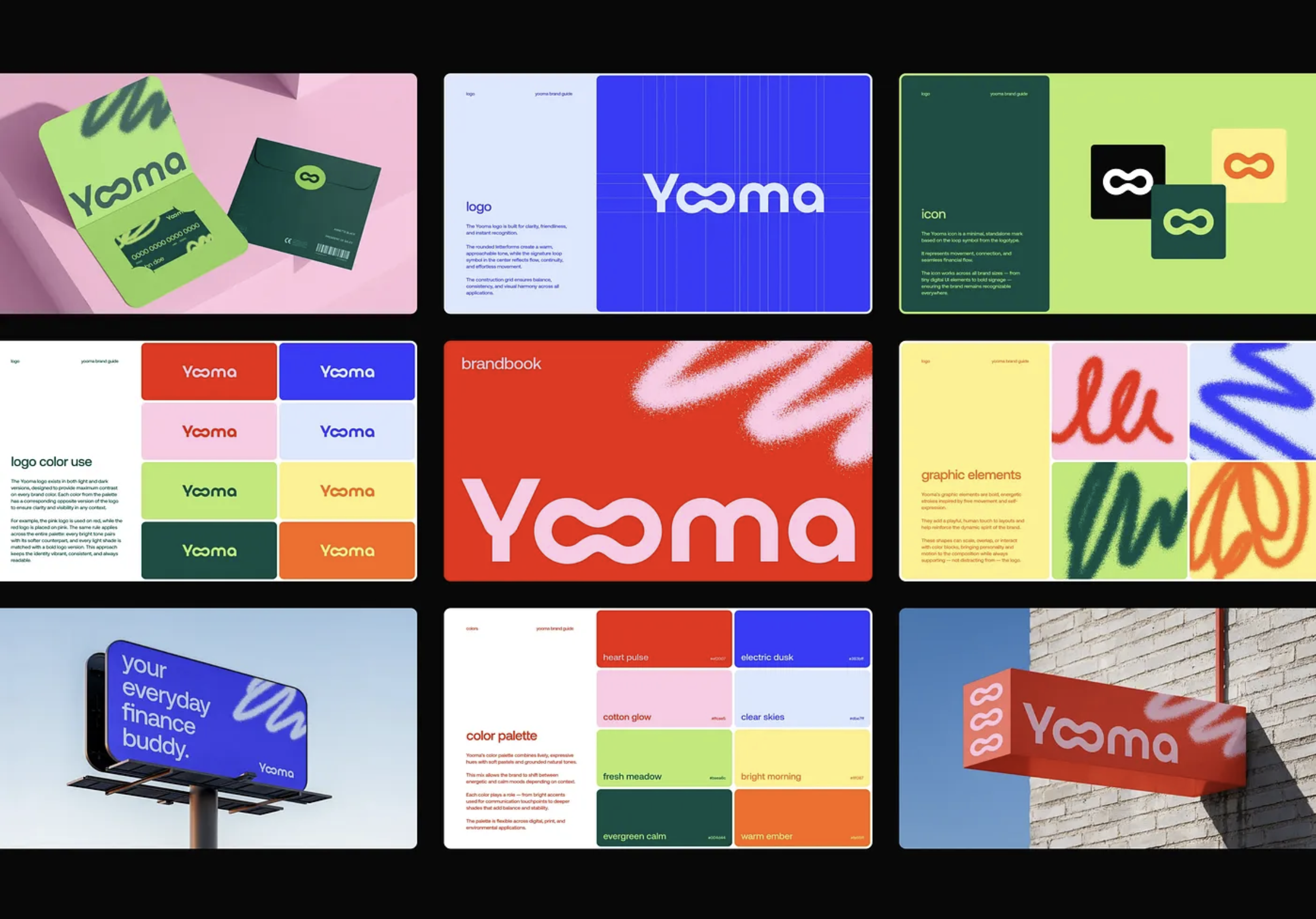
7. Modular framework instead of a rigid brand book
Brands grow unevenly. New products, partnerships, services, formats appear. The old approach of writing everything down once and forever stopped working. It breaks with any growth or strategy change.
In 2026, the shift to modular identity systems strengthens. This is not one rigid template but a constructor where elements connect by rules but allow variation. Such an approach lets a brand remain recognizable even when it expands or changes focus.
Visually this looks like:
- not one pattern, but several structural modules;
- elements that can be combined in different ways;
- a grid that adapts to content rather than forcing content to adapt;
- a single visual framework that gives integrity to the system.
This framework withstands company growth, direction changes, and new formats. Identity stays whole and recognizable even when scale, direction, or content type changes.
8. Analog + digital
We now live in two worlds at once: digital and physical. Brands already understand that a fully digital visual feels flat, while a fully analog one feels outdated.
In 2026, a mixed approach gains strength. It gives the brand a sense of depth and cultural layer. You could describe it as a felt memory. It’s about a layer of associative memories that are read faster than logic. That means referring to culture, memory, emotions, personal experience.
Visually this appears as:
- scans, fragments of paper, layered textures;
- retro‑futuristic shapes and soft geometries;
- neat analog roughness over digital precision;
- compositions that give a sense of time, experience, history.
Such an aesthetic makes identity deeper and more sensory. It stops being just a picture on a screen and becomes something you can almost touch. This increases engagement: the gaze lingers, the brain notices layers, a connection forms.

9. Focus on cybersecurity
People are tired of data leaks, phishing emails, questionable notifications, and constant requests to confirm their identity. Cybersecurity has ceased to be purely technical. Now it’s part of how the brand is perceived and how much trust it earns.
If a company shows it treats data protection as seriously as product and design, this strengthens its reputation.
For brands this means they must:
- implement two‑factor authentication right away, not someday;
- train the team and reduce human error, the most common source of hacks;
- collect only necessary data and avoid storing what isn’t needed;
- control infrastructure, understand where and how information is stored;
- explain in plain language to users which data is protected and by what methods.
Cybersecurity becomes another element of the brand that builds trust.
Conclusion
At year’s end we traditionally read trend roundups. Usually they deal with visual style and new tricks.
For branding in the coming years the conversation is far more serious. Major shifts await branding. The very foundation of how brands work and how people perceive them is changing.
A brand that can communicate will survive. A brand that can adapt will survive. If you stay flexible, curious, and willing to rethink old habits, the next few years will work in your favor.
We must adapt to a new reality. Yes, it’s a challenge, but also new opportunities for growth. So let’s keep moving forward. Let the next year be productive and meaningful.